
Tonewood®
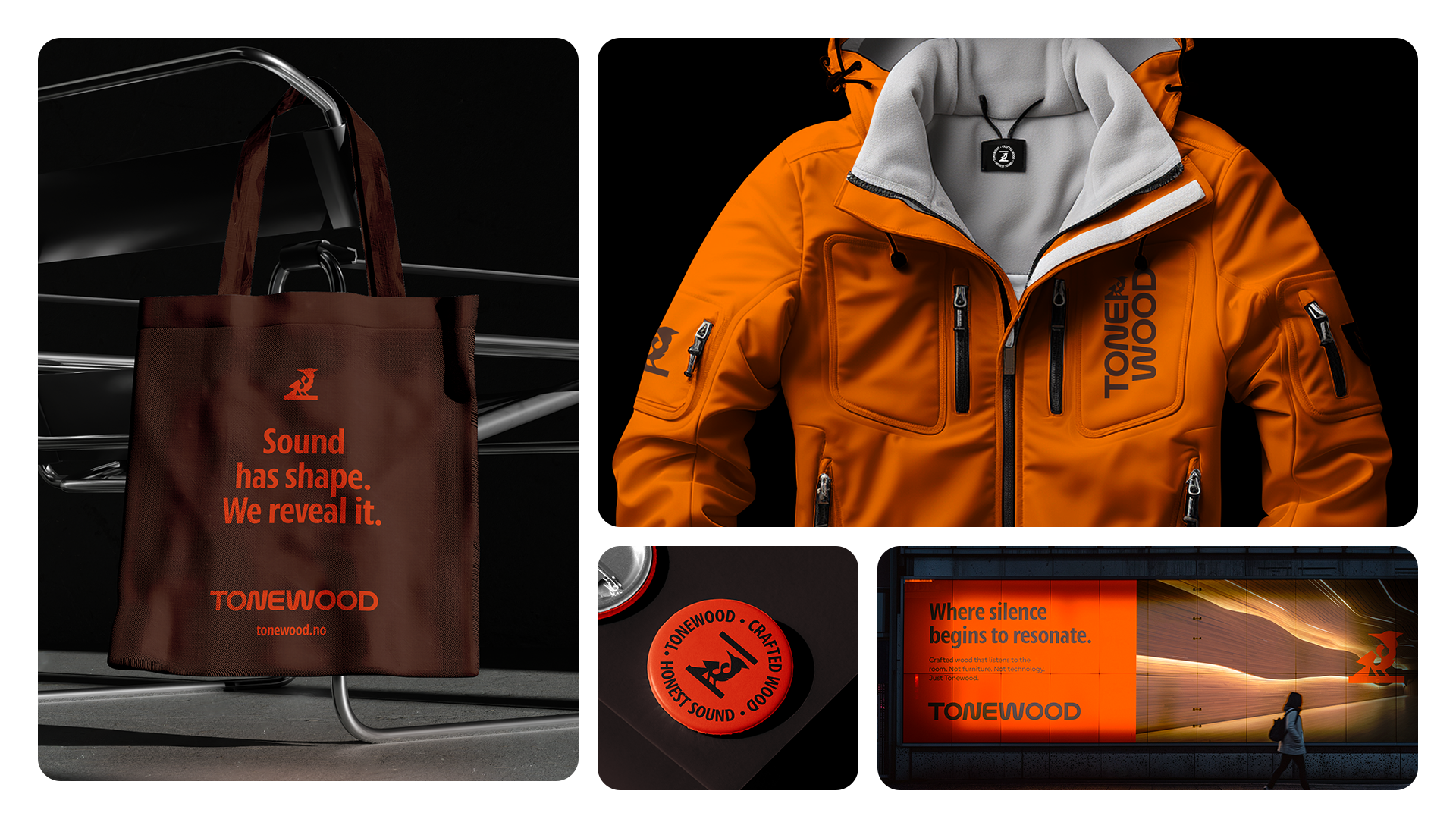
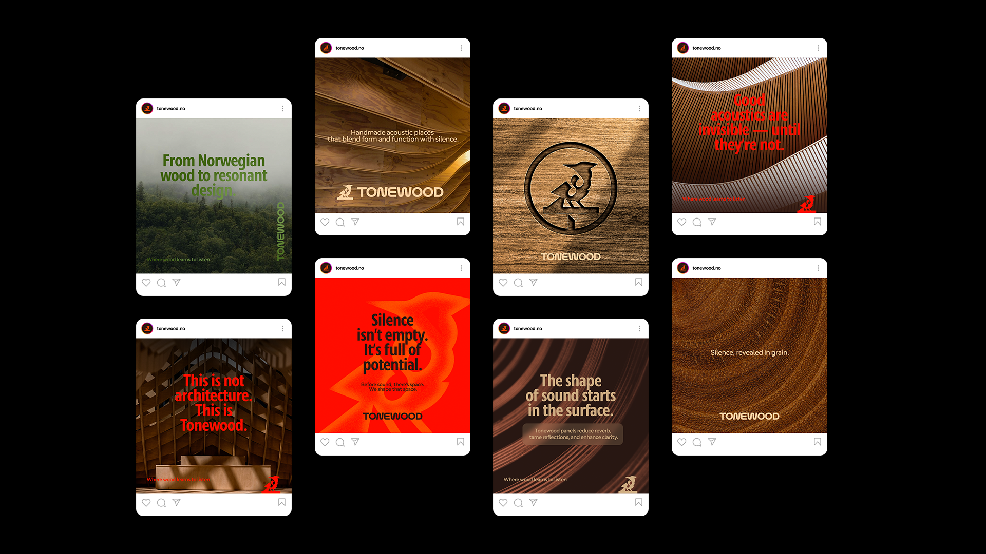
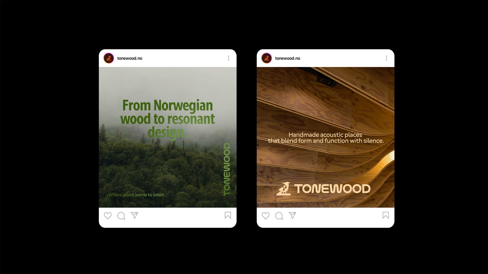
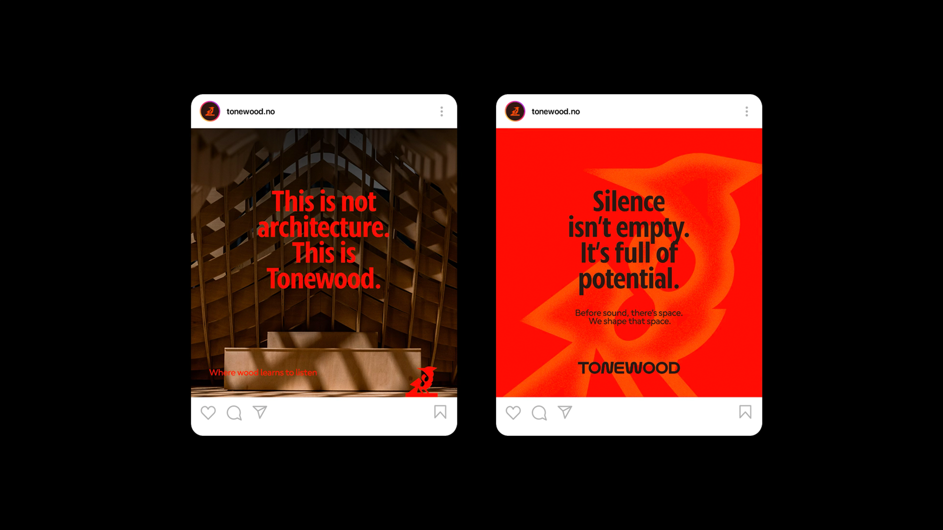
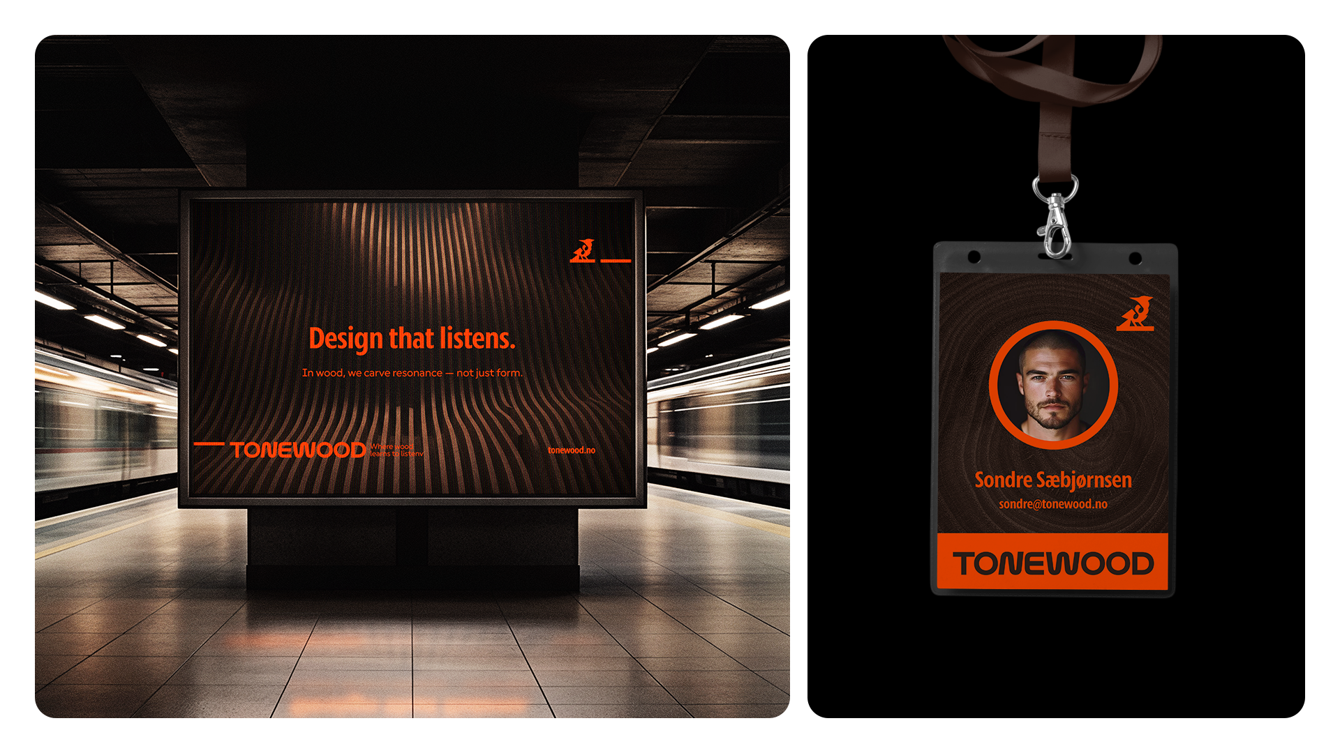
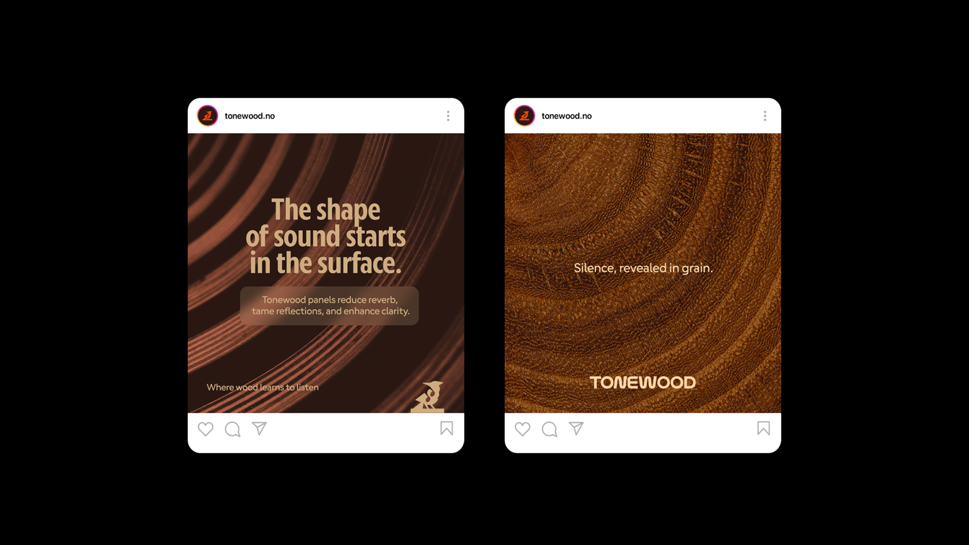
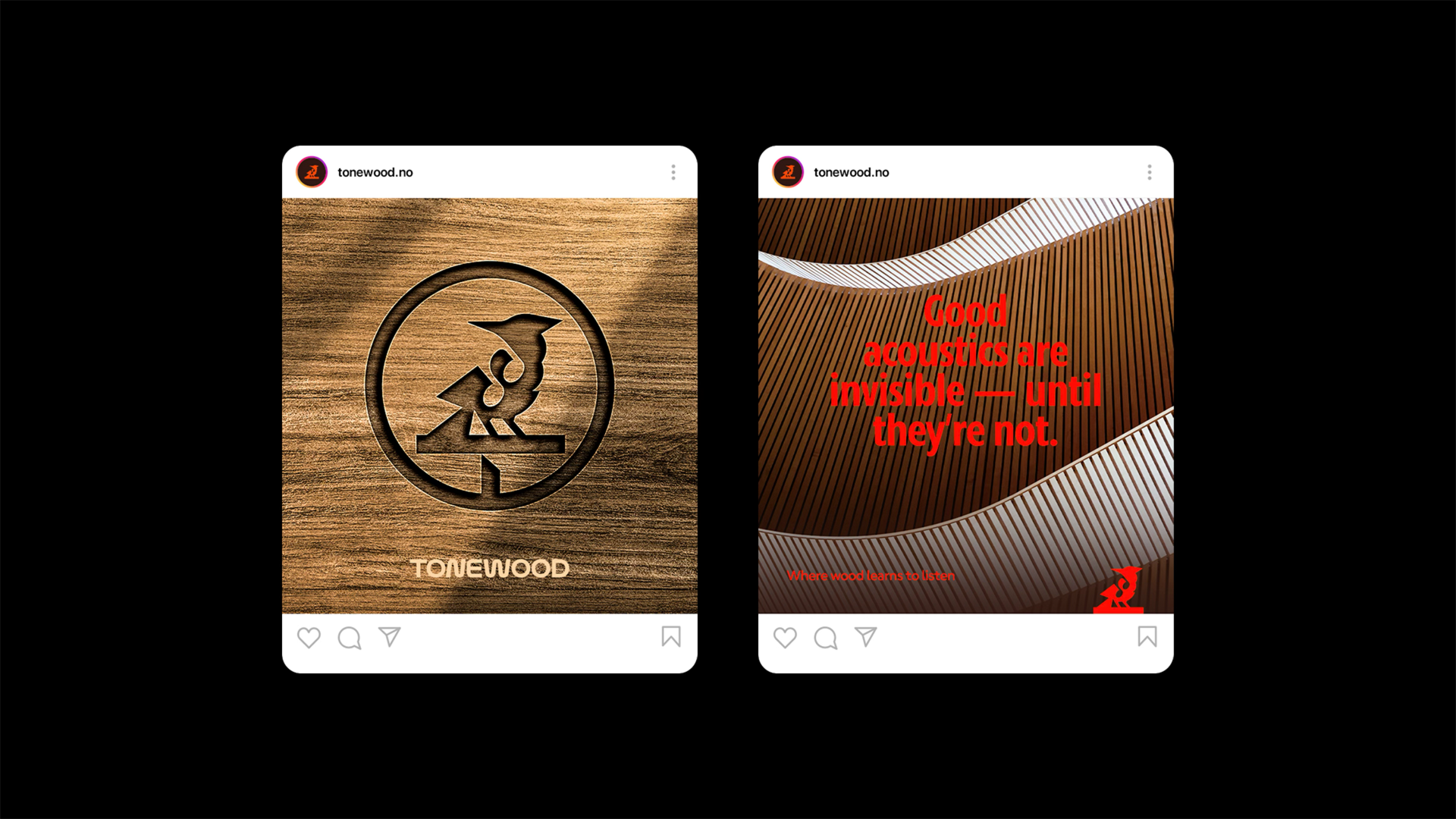
Tonewood is a brand identity built around a quiet but powerful idea: sound is not only something we hear, but something we shape. Created for an acoustic wood studio rooted in Norway, the project translates craftsmanship, silence, material intelligence, and spatial sensitivity into a complete visual and verbal system. Instead of positioning the brand as furniture or technology, the identity moves toward something more essential: the creation of presence. Tonewood exists in the space between hand and material, between architecture and listening, between the visible grain of wood and the invisible movement of sound. It is a brand for those who understand that a room does not simply contain sound, it responds to it.
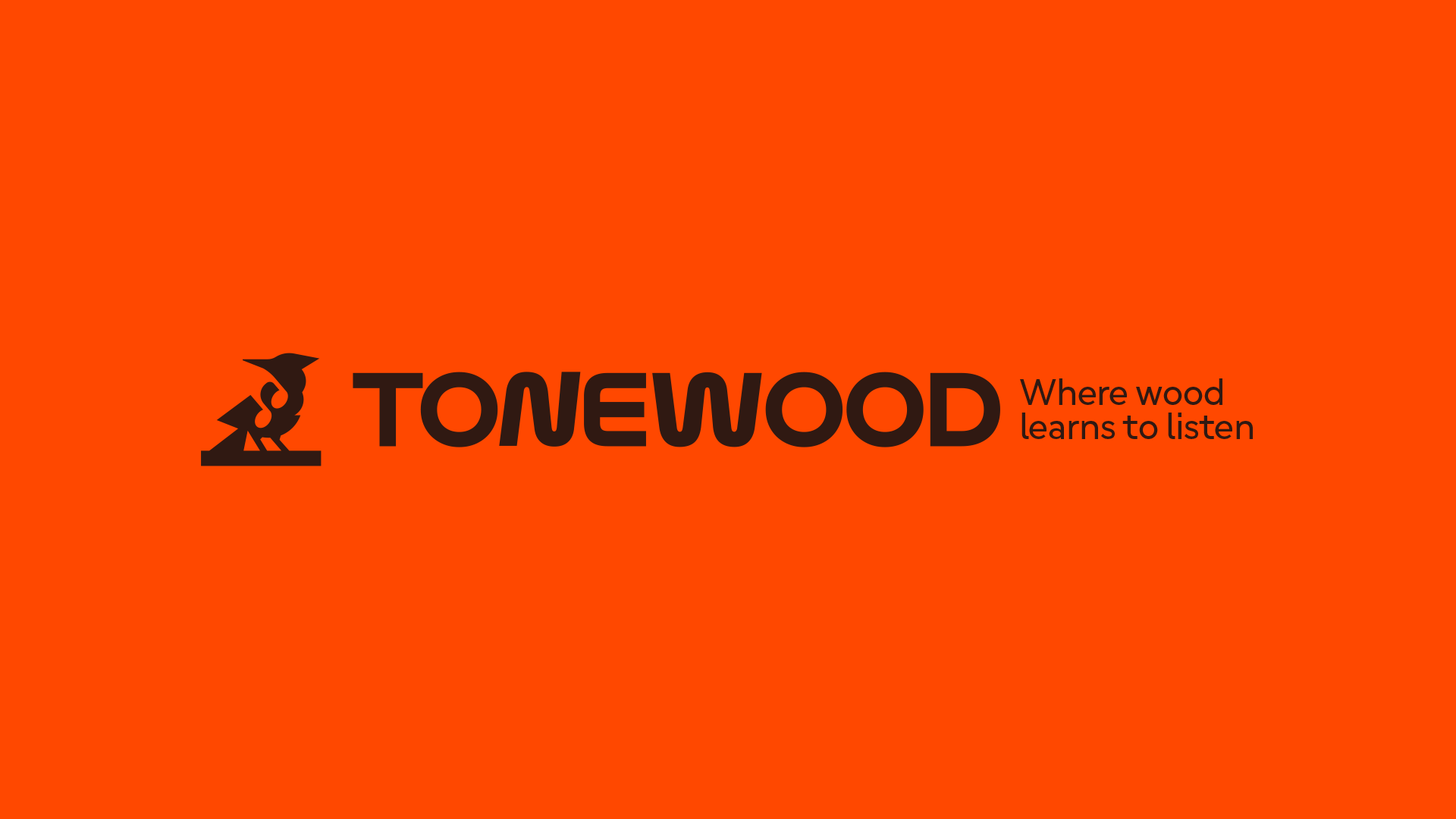
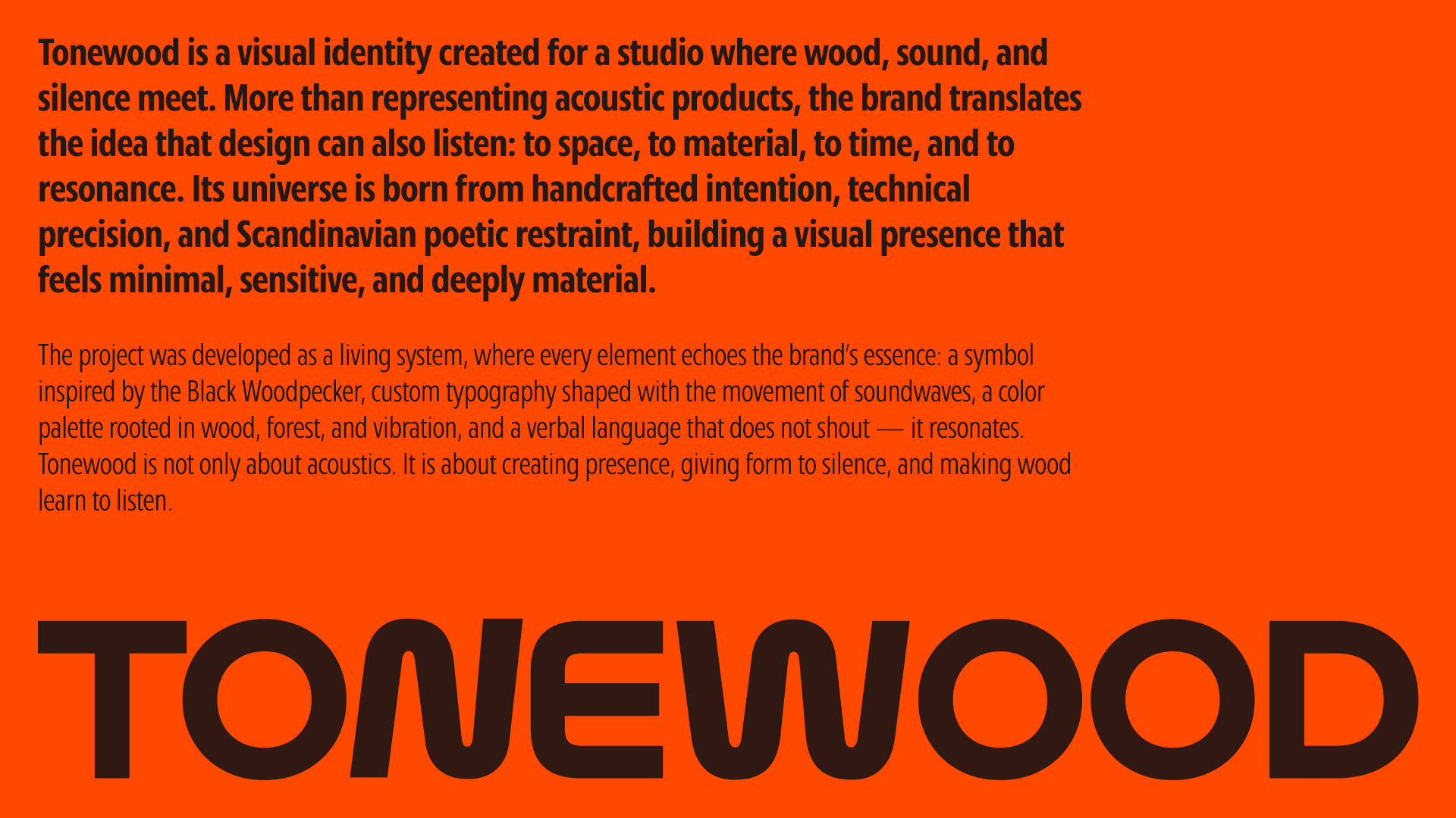
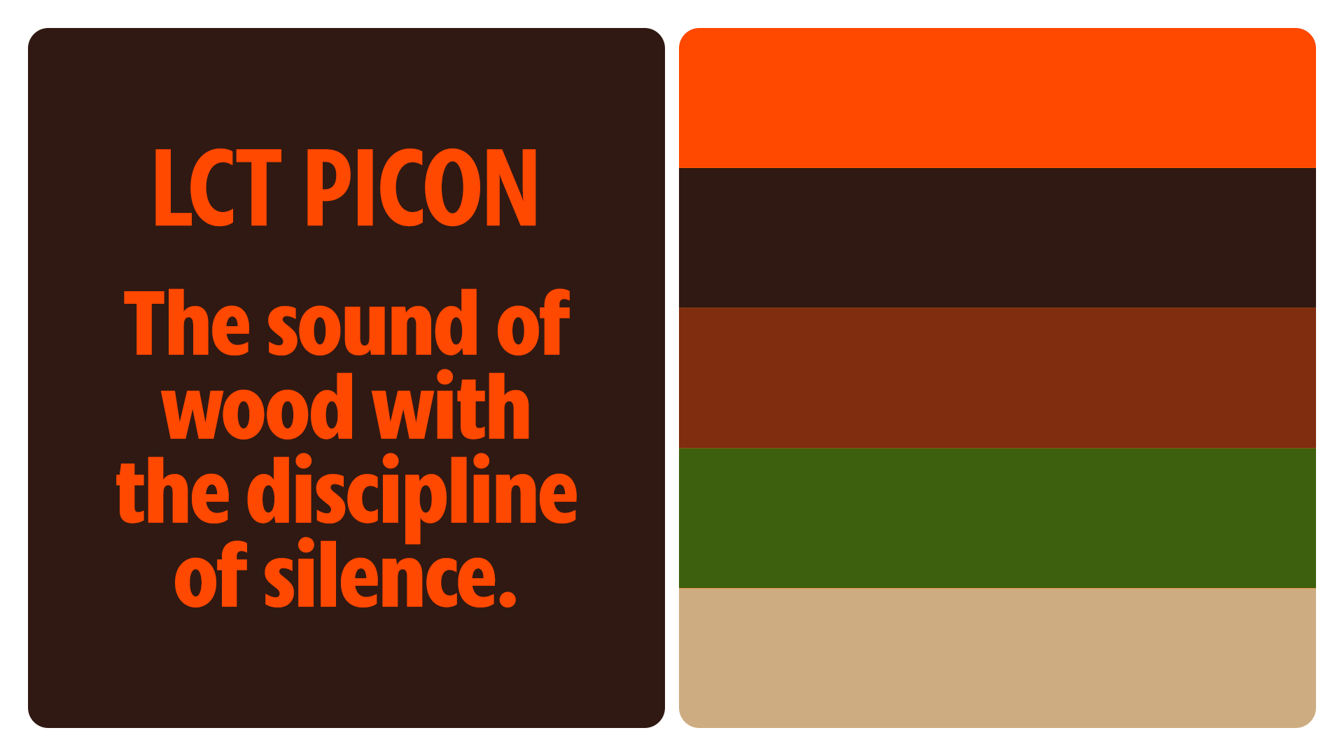
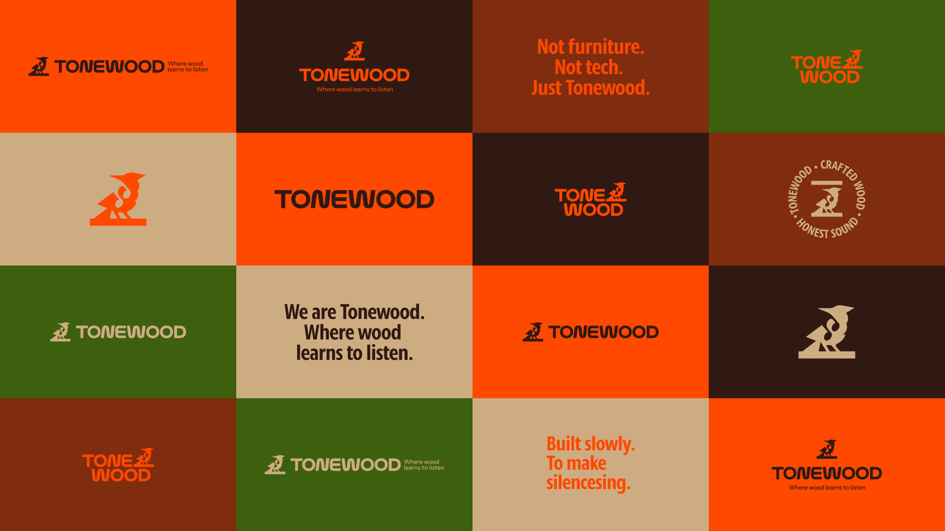
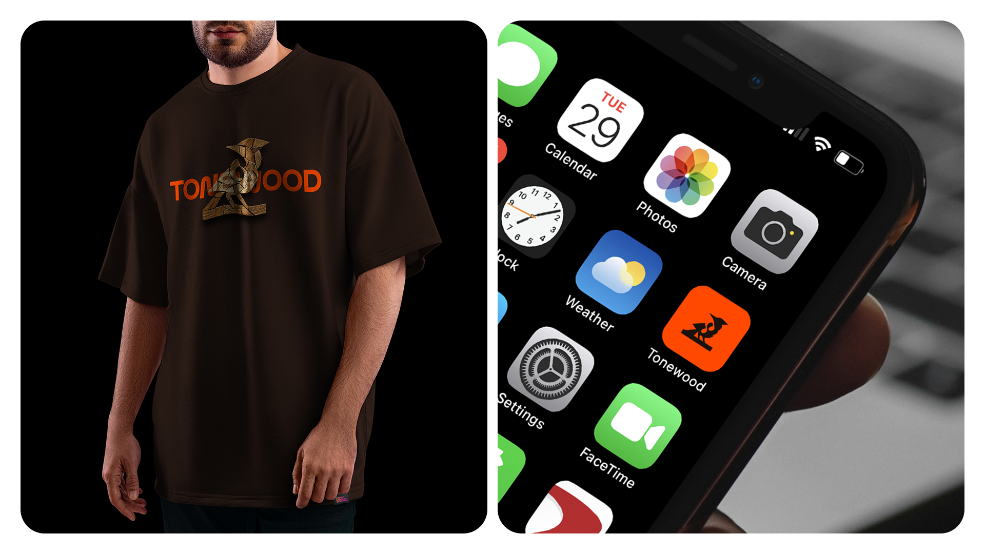
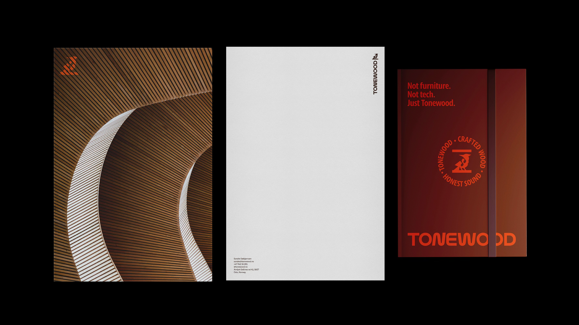
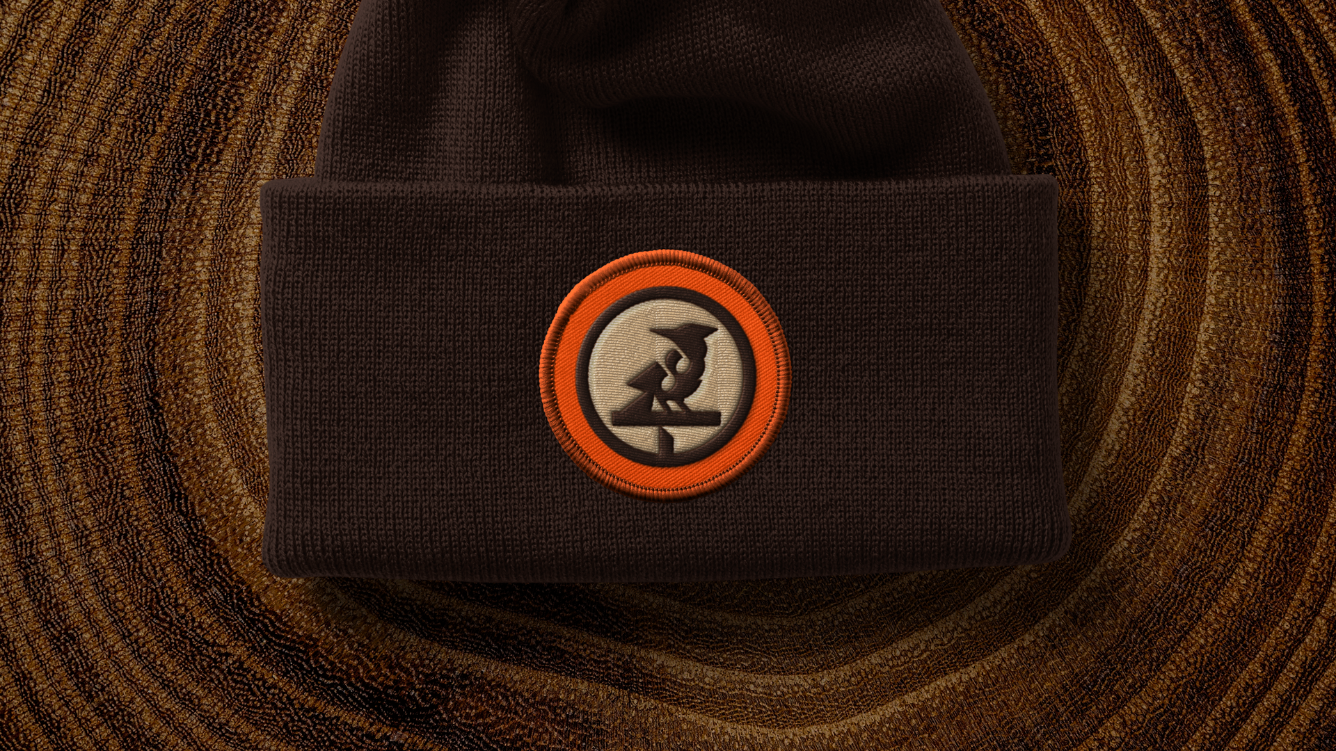
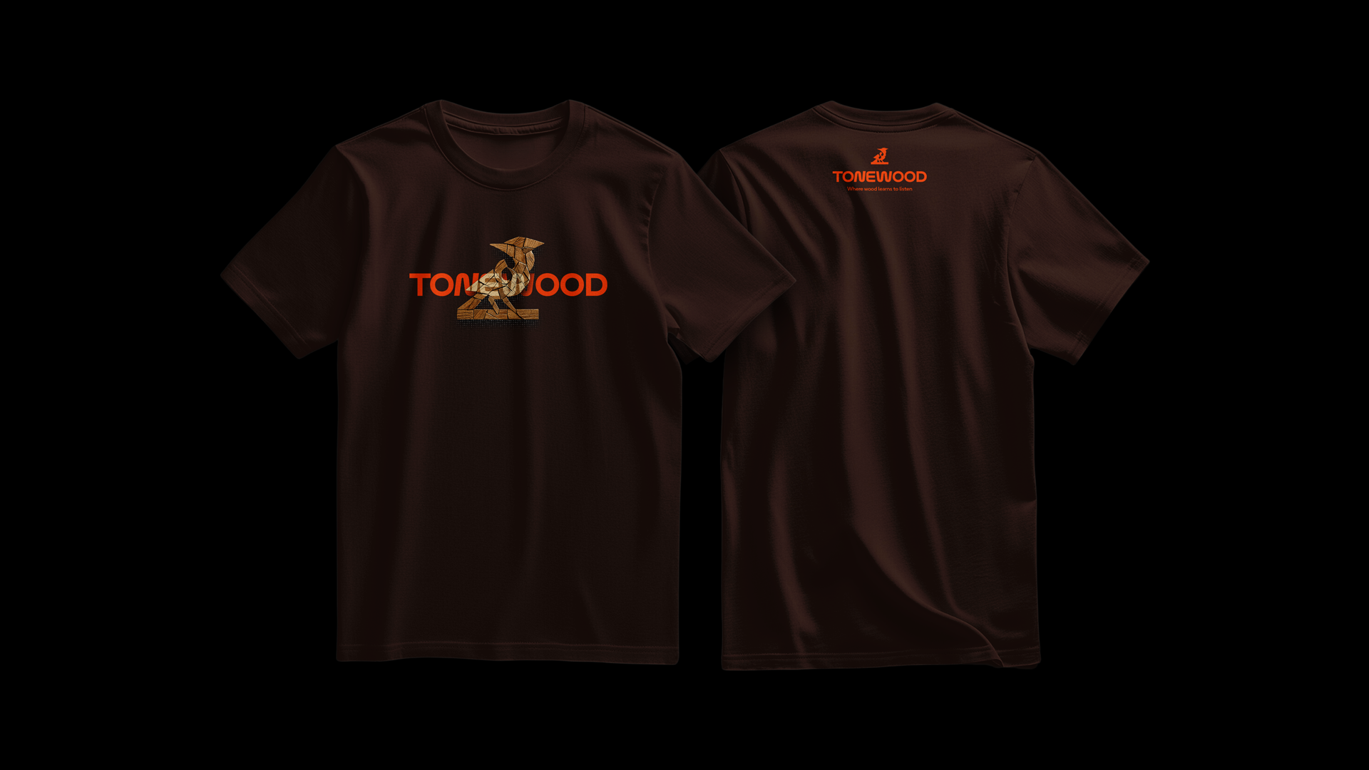
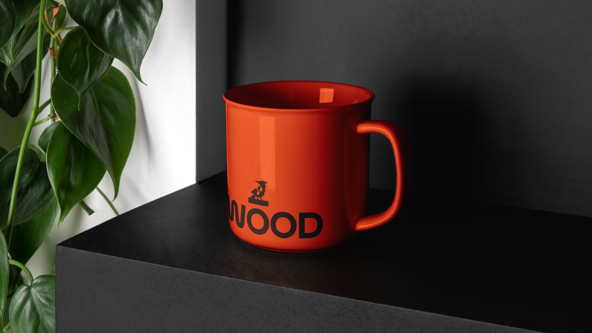
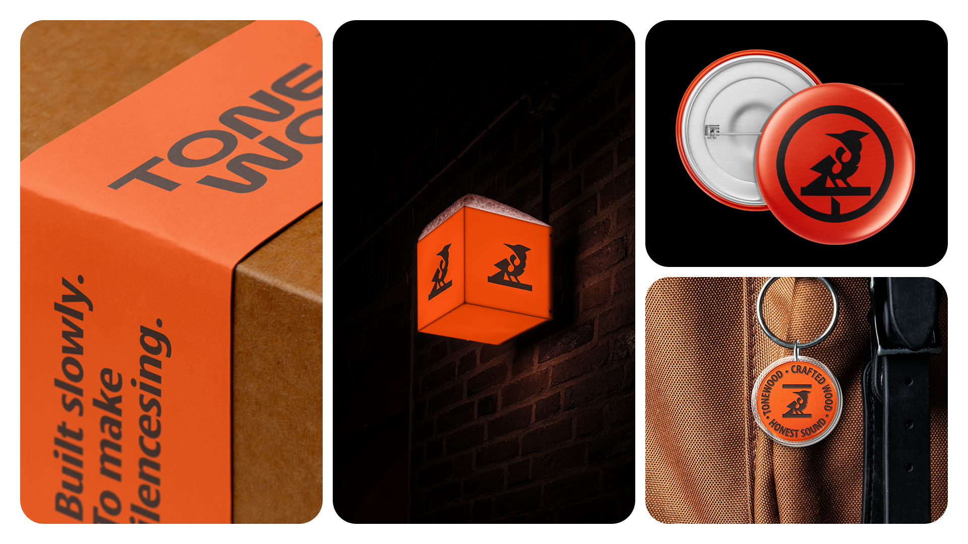
Every element of the identity was designed to resonate with this philosophy. The symbol, inspired by the Black Woodpecker, becomes a metaphor for instinctive acoustic knowledge: a creature that listens to wood before touching it. The custom typography carries subtle wave-like movements, as if the letters themselves had been shaped by vibration. The color palette brings together burnt walnut, mahogany, forest moss, birch sand, and a vivid resonant orange — tones that speak of wood, earth, silence, and energy. Together, the system creates a brand that feels minimal but warm, technical but human, poetic but precise. Tonewood is not loud. It does not need to be. It is a quiet mark for a brand that understands one rare truth: the deepest design begins when we stop speaking and start listening.


Follow me!
Designed in Brasil by matheuscorseuil®.
© All rights reserved.