
EN
Do you know that market that is part of the life of the town?
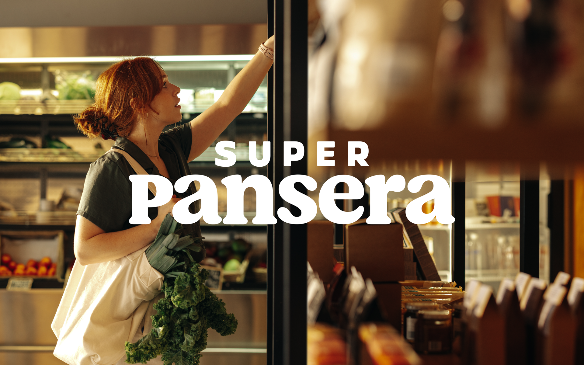
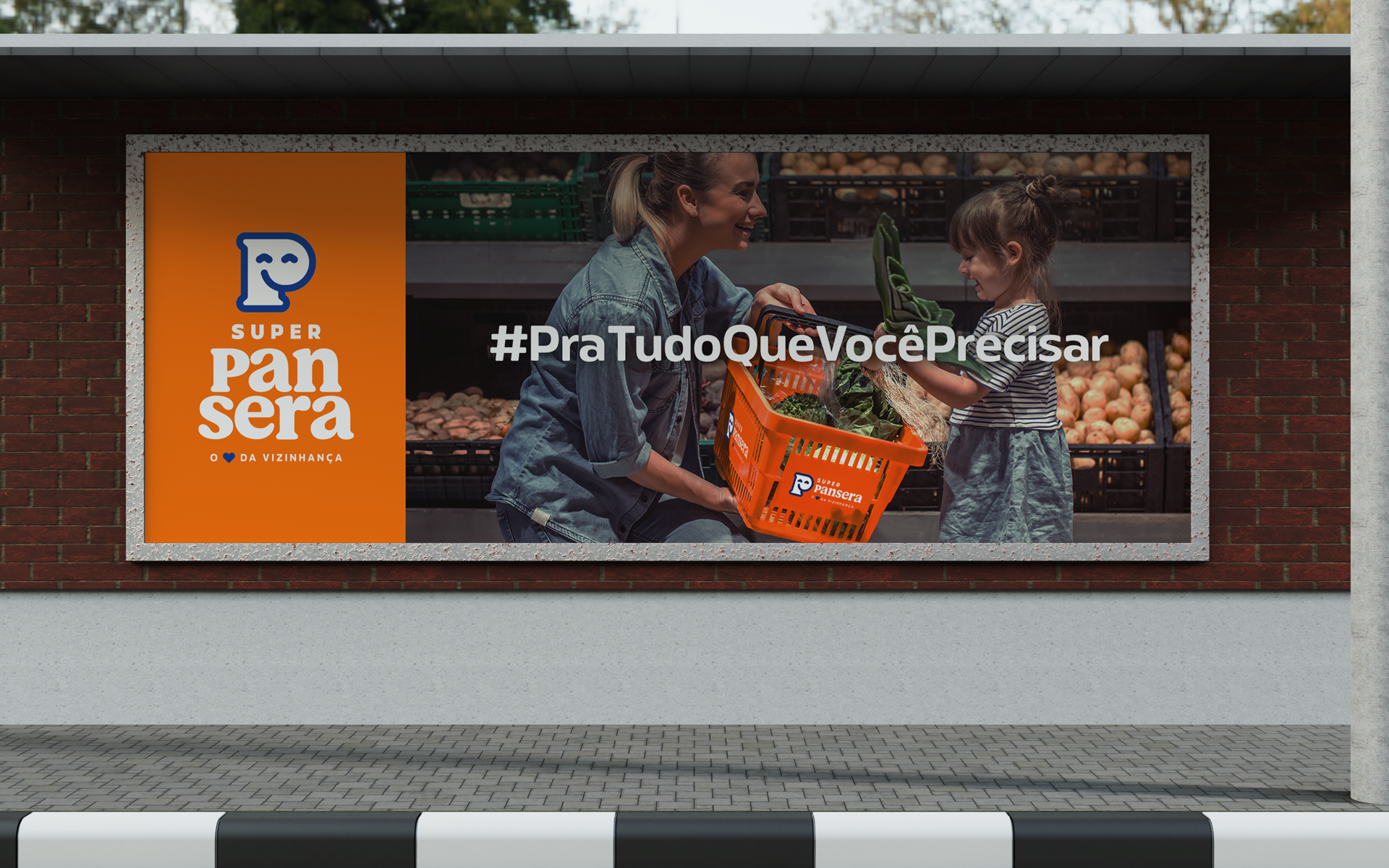
That's Super Pansera, a family-run business that for 30 years has been a meeting point for the community of Anchieta, in the interior of Santa Catarina.
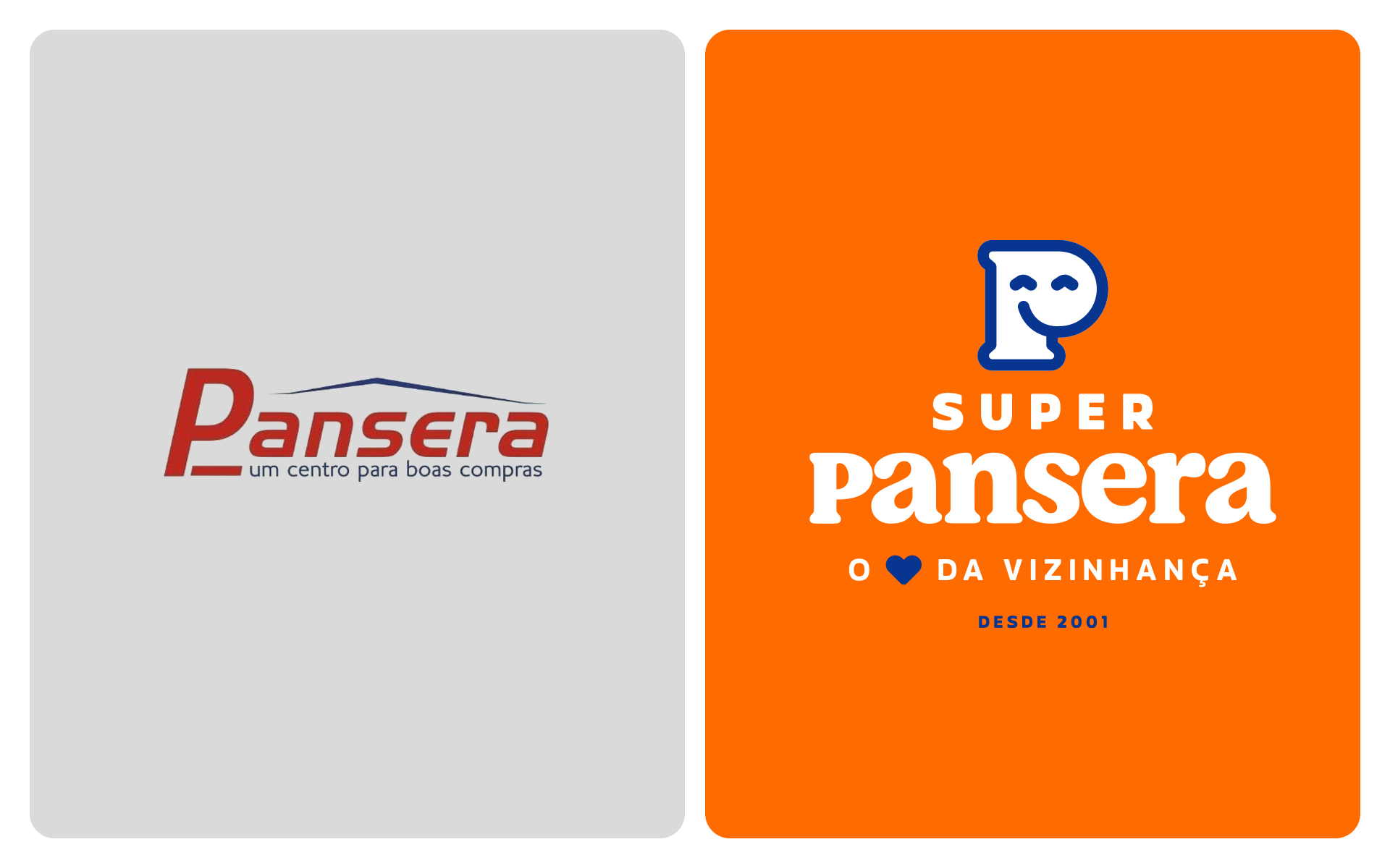
Going through a moment of renewal in its brand strategy, we were invited to develop a new verbal and visual identity to accompany this phase of evolution in the market.
During our first meeting with the Super Pansera team, we immediately noticed the warmth and energy of people who really care about delivering the best and treat each customer like a dear neighbor.
That's Super Pansera, a family-run business that for 30 years has been a meeting point for the community of Anchieta, in the interior of Santa Catarina.
Going through a moment of renewal in its brand strategy, we were invited to develop a new verbal and visual identity to accompany this phase of evolution in the market.
During our first meeting with the Super Pansera team, we immediately noticed the warmth and energy of people who really care about delivering the best and treat each customer like a dear neighbor.
PT/BR
Sabe aquele mercado que faz parte da vida da cidade?
Esse é o Super Pansera, um empreendimento familiar que há 30 anos é um ponto de encontro da comunidade de Anchieta, no interior de Santa Catarina.
Passando por um momento de renovação em sua estratégia de marca, fomos convidados para desenvolver uma nova identidade verbal e visual para acompanhar essa fase de evolução no mercado.
Em nosso primeiro encontro com o time do Super Pansera, percebemos de cara o acolhimento e energia de pessoas que realmente se importam em entregar o melhor e tratam cada cliente como um vizinho querido.
EN
Throughout the project, we sought to respect and strengthen this essence, giving it a more contemporary and structured look, but above all, one that was close to our hearts.
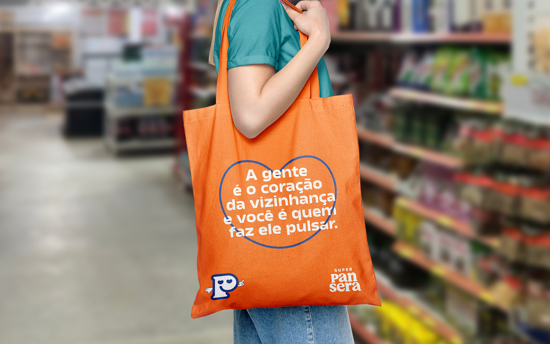
In the verbal identity, we embraced the positioning concept of being “the heart of the neighborhood” and amplified it with a light and inclusive tone of voice.
In the verbal identity, we embraced the positioning concept of being “the heart of the neighborhood” and amplified it with a light and inclusive tone of voice.
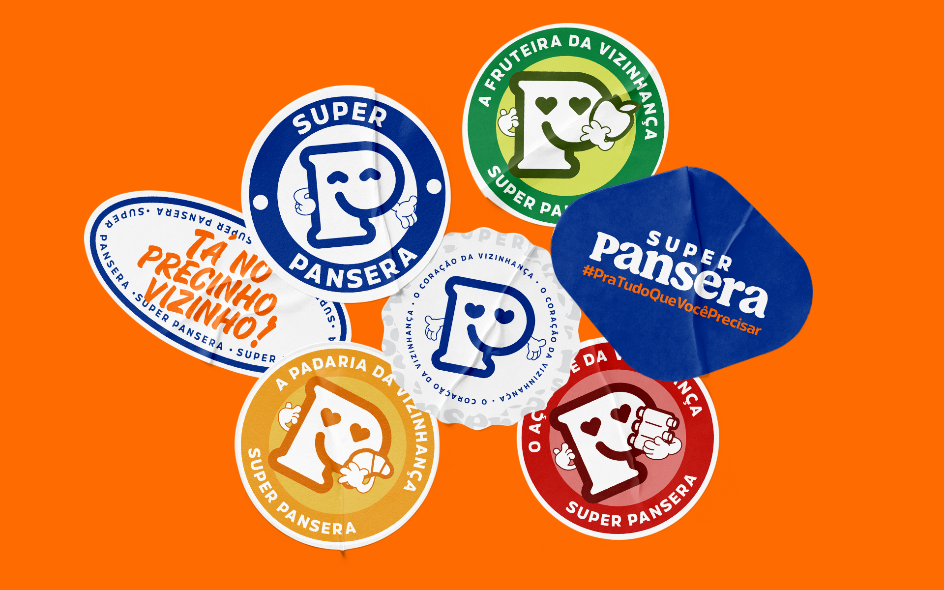
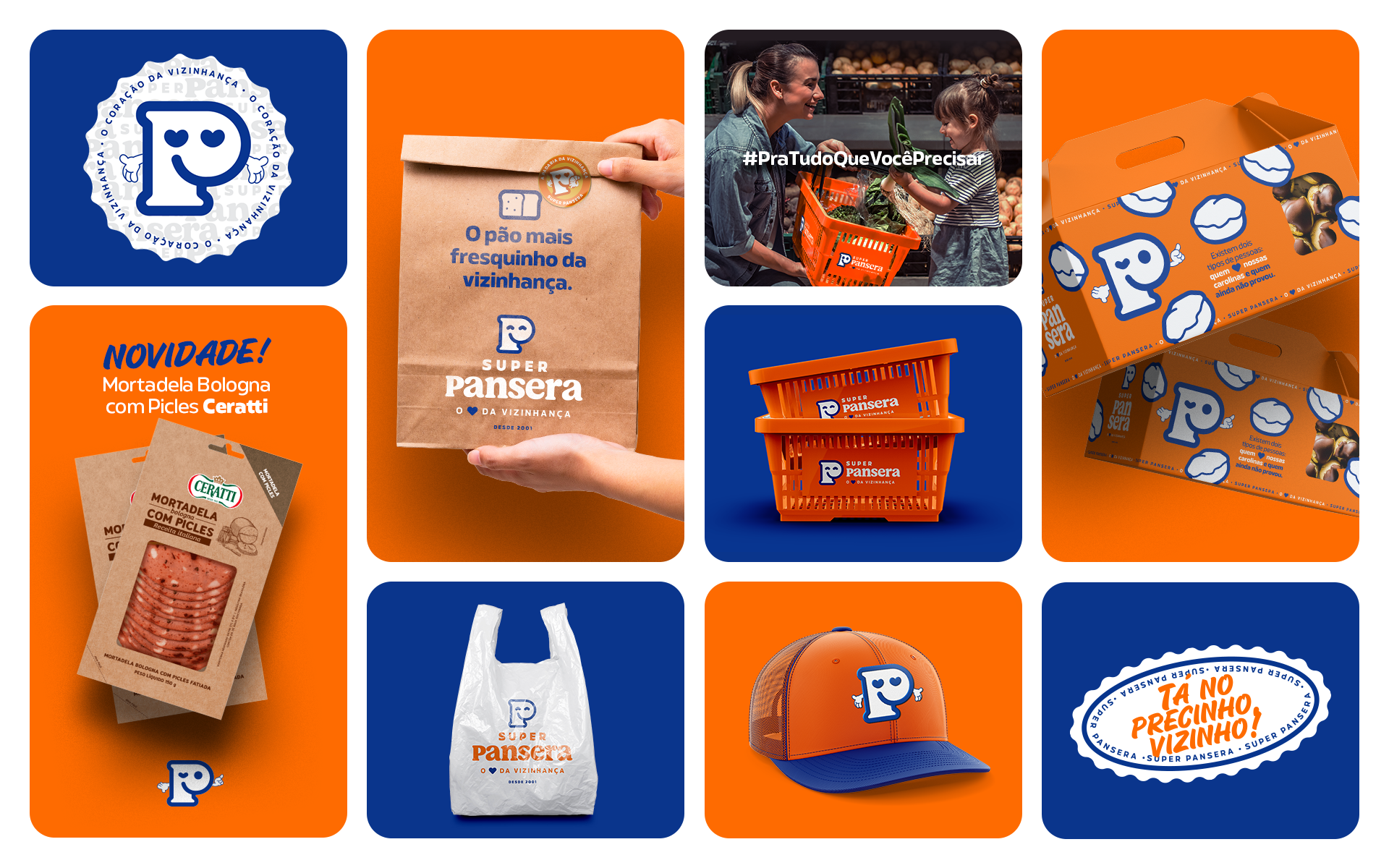
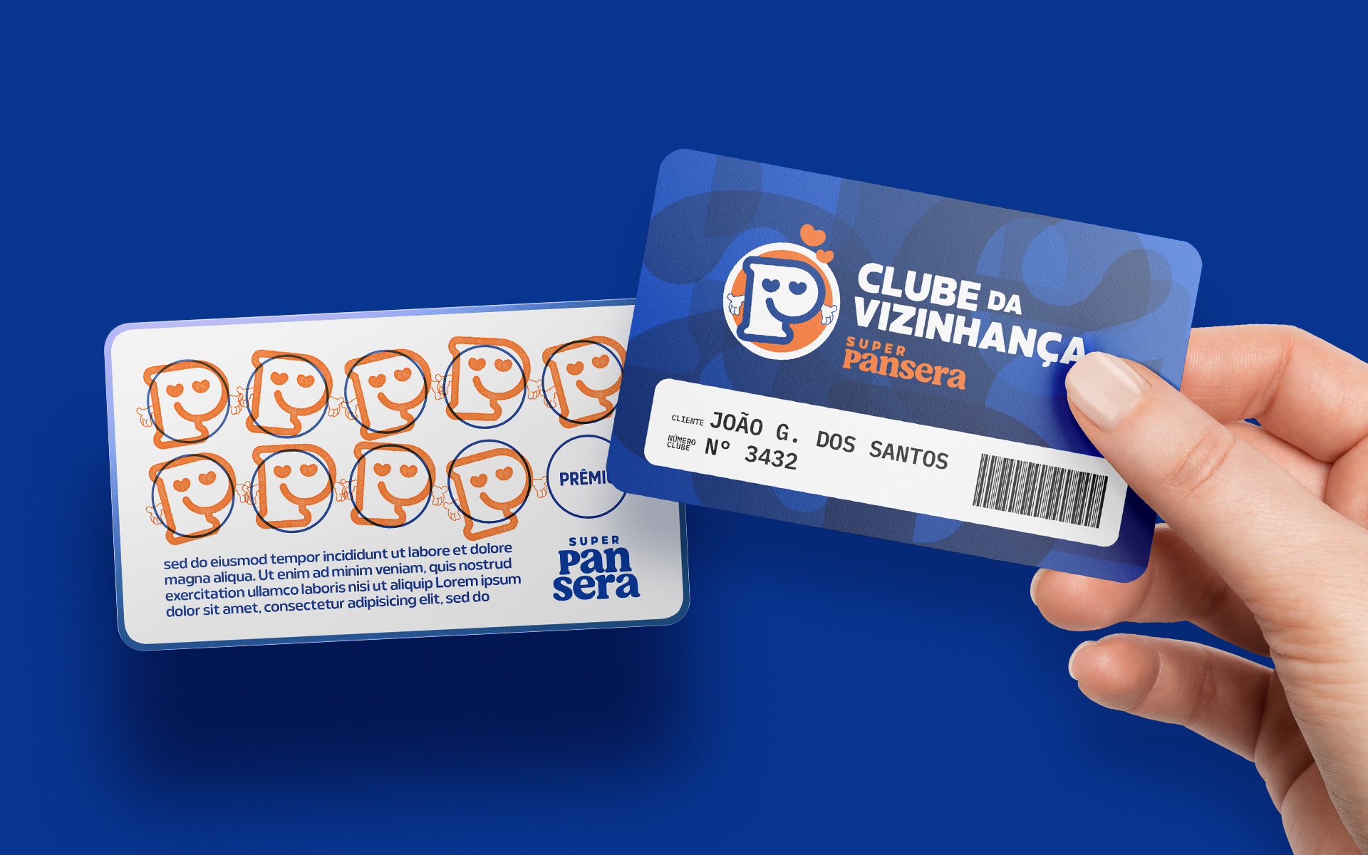
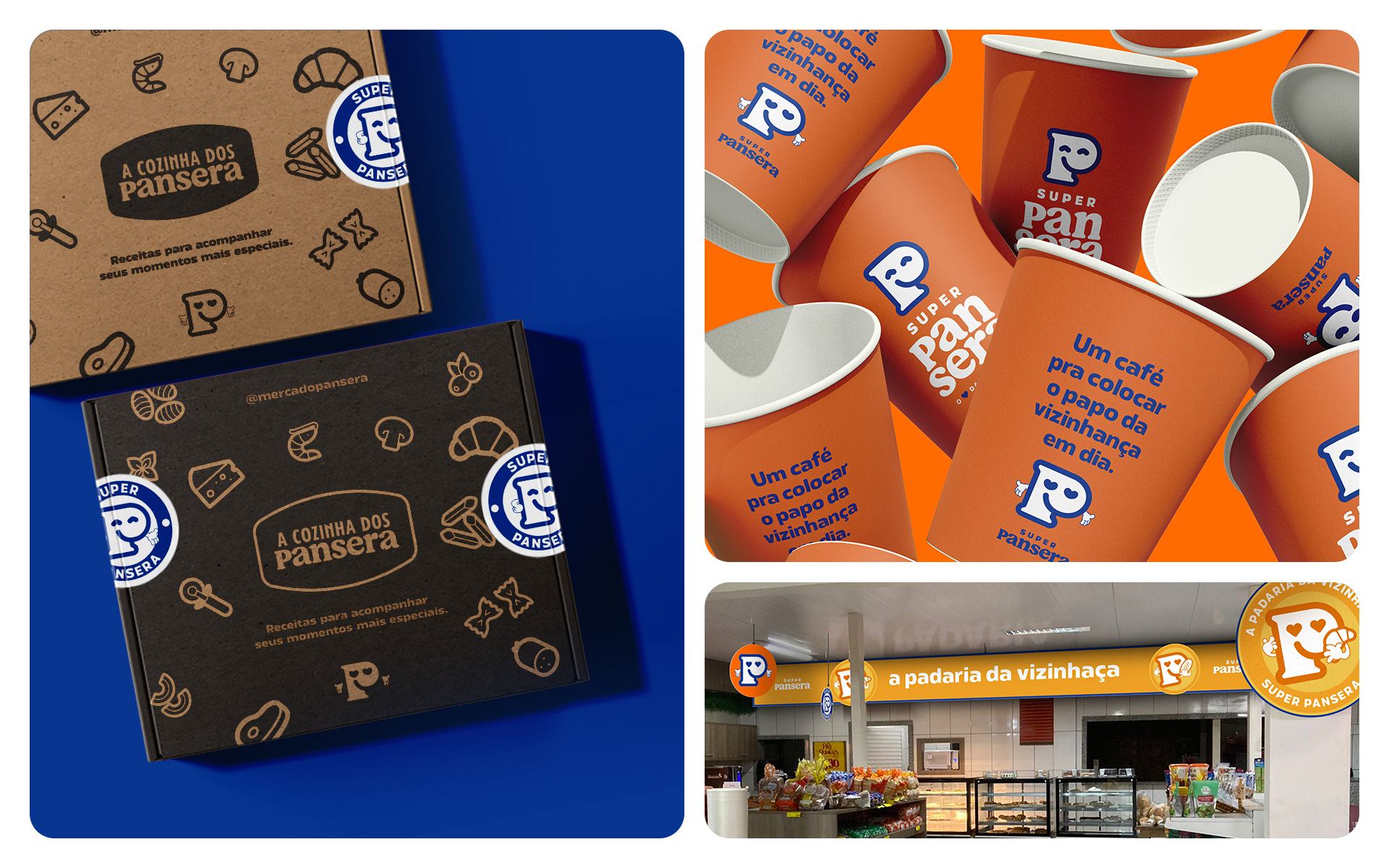
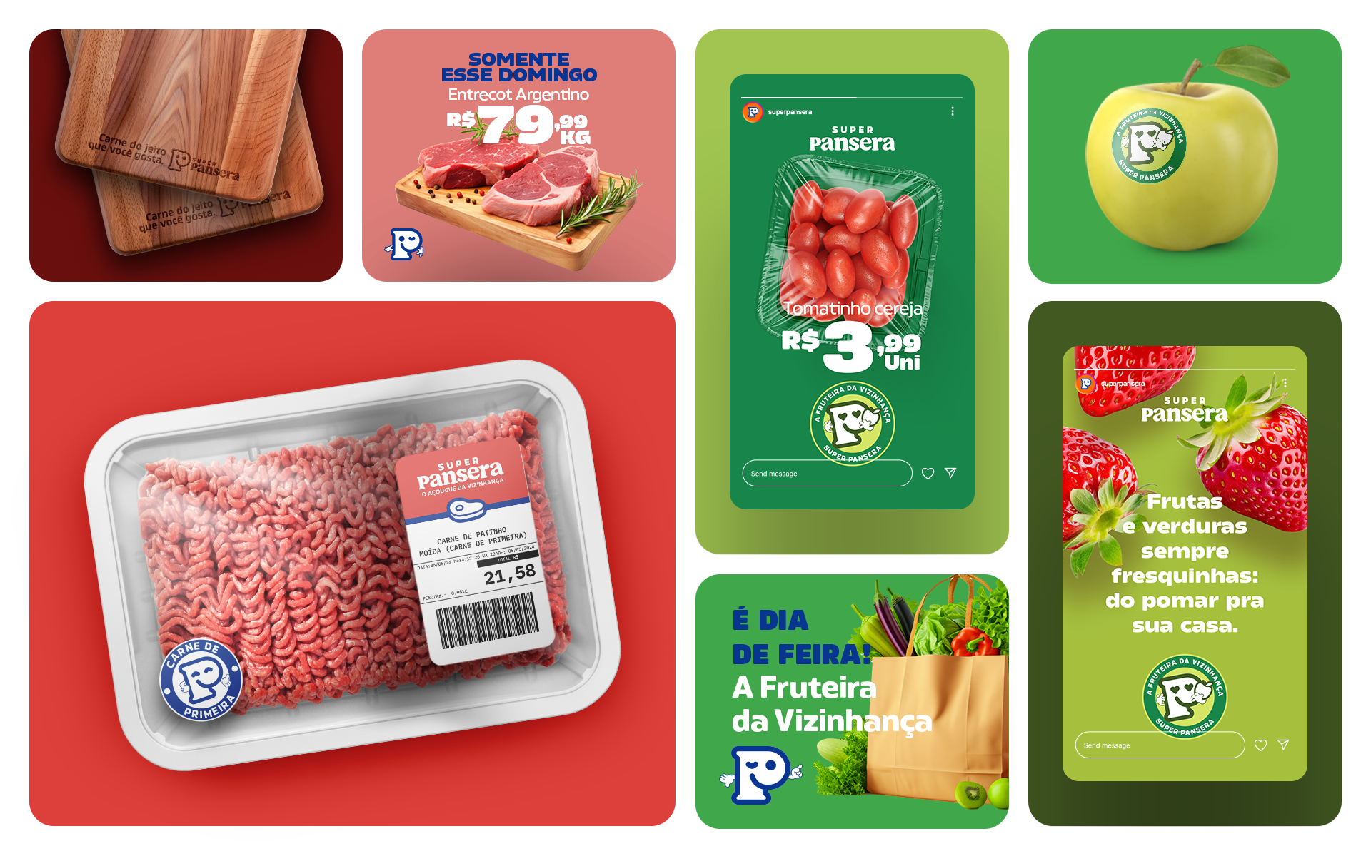
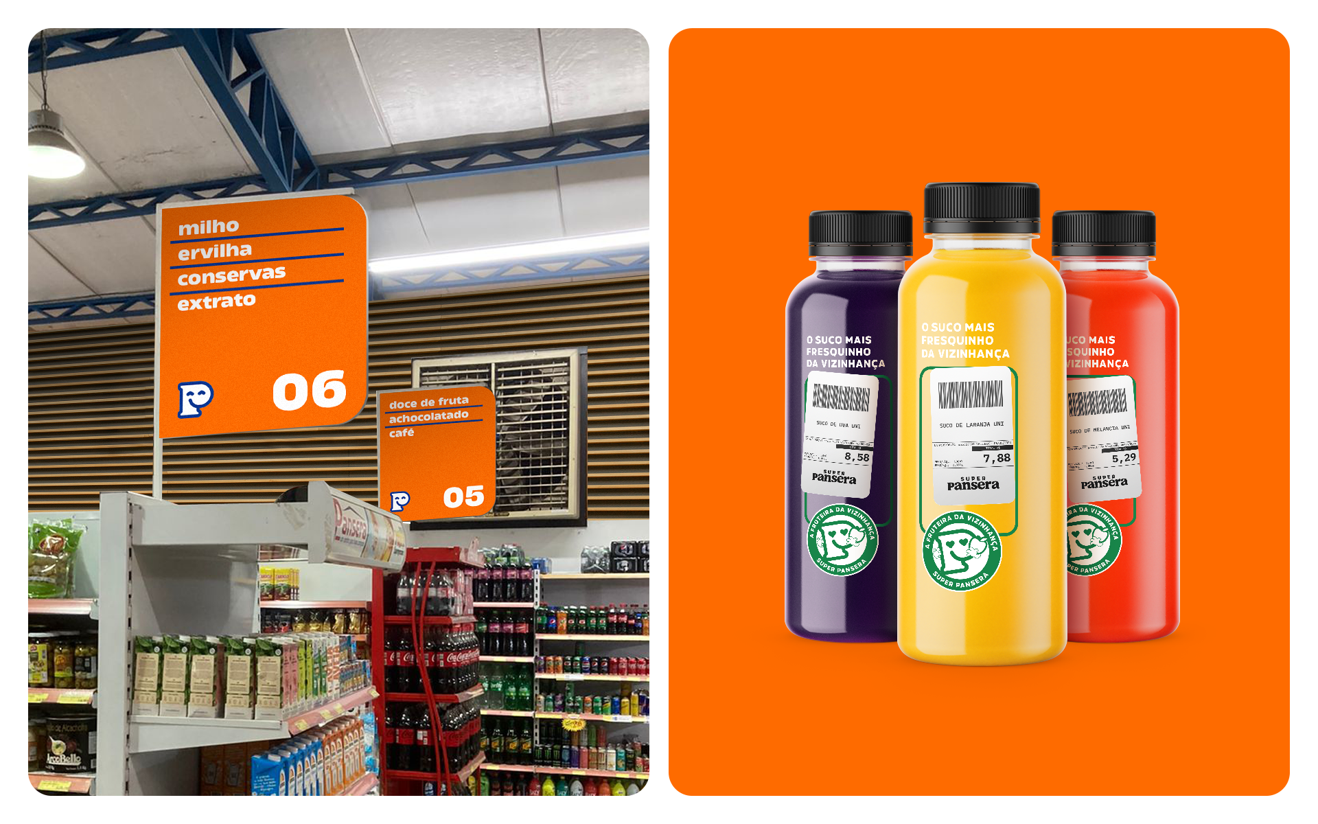
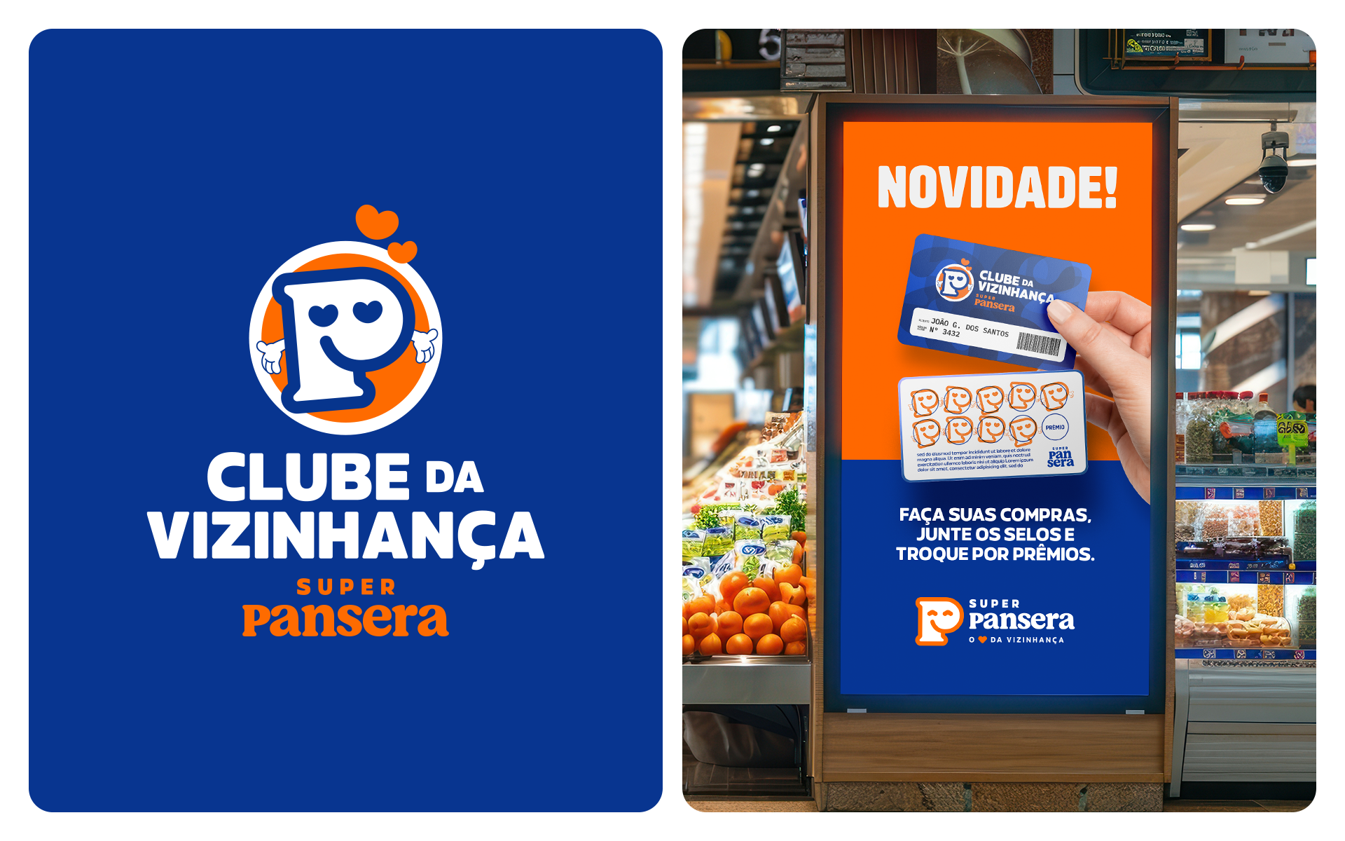
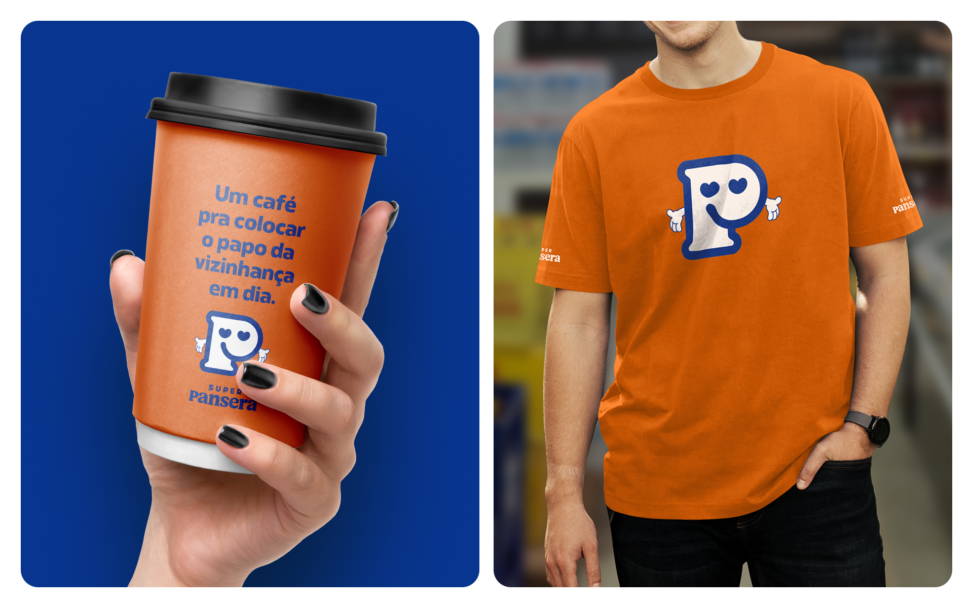
The new visual identity uses vibrant colors and friendly typography, which brings the warmth and charisma of a good neighbor that everyone knows and trusts. To standardize communication and make it easier to use on a day-to-day basis, we structured a system that unfolds across all the supermarket's fronts (grocery, bakery, butcher, promotions), with support palettes and specific layout patterns for each sector to communicate in its own way without losing tune.
PT/BR
Durante todo o projeto, buscamos respeitar e fortalecer essa essência, conferindo roupagem mais contemporânea e estruturada, mas acima de tudo, próxima.
Na identidade verbal, abraçamos o conceito do posicionamento de ser "o coração da vizinhança" e o ampliamos com um tom de voz leve e inclusivo.
A nova identidade visual utiliza cores vibrantes e uma tipografia amigável, que traz o calor e o carisma de um bom vizinho que todos conhecem e confiam. Para padronizar a comunicação e facilitar o uso no dia a dia, estruturamos um sistema que se desdobra em todas as frentes do supermercado (hortifruti, padaria, açougue, promoções), com paletas de apoio e padrões layout específicos para cada setor se comunicar de maneira própria sem perder a sintonia.

EN
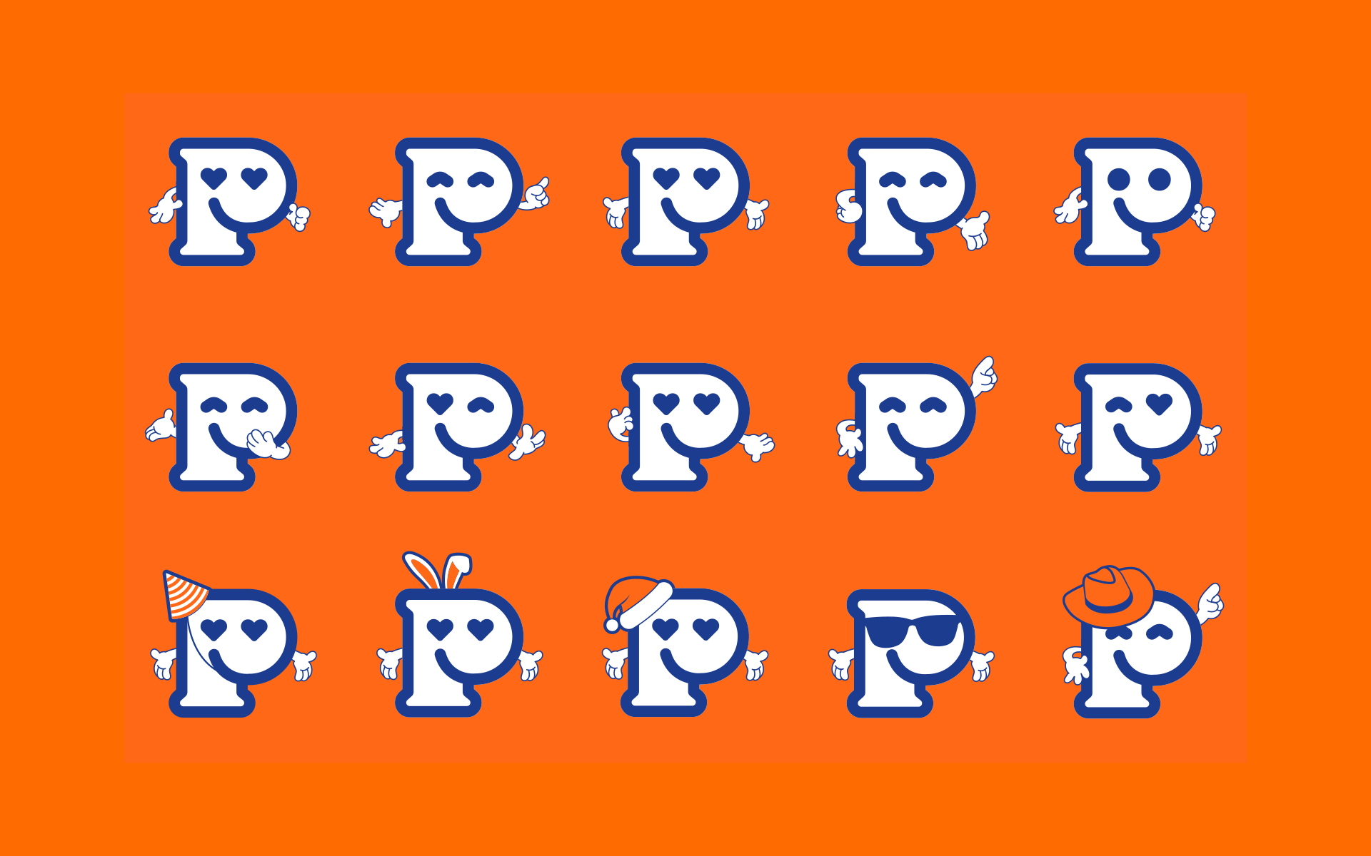
The special spice of the project goes to “Pezito”, the mascot developed for the brand that makes the supermarket come to life in an iconic and memorable way. The friendly figure reinforces the bond of closeness and familiarity that Super Pansera has built up over the years.
PT/BT
O tempero especial do projeto fica para o "Pezito", o mascote desenvolvido para marca que faz o supermercado ganhar vida e de maneira icônica e memorável. A figura simpática reforça o laço de proximidade e familiaridade que o Super Pansera construiu ao longo dos anos.


Chaminé Team
Project Manager: Dilceu Blon
Desk Research: Sandinara Antunes
Strategy & Verbal Identity: Pablo Eduardo Frandoloso
Creative Director: Daniel Zonta
Brand Designer: Matheus Corseuil
Project Manager: Dilceu Blon
Desk Research: Sandinara Antunes
Strategy & Verbal Identity: Pablo Eduardo Frandoloso
Creative Director: Daniel Zonta
Brand Designer: Matheus Corseuil
Client
Super Pansera | 2024
Super Pansera | 2024
Project
estratégia de marca | identidade visual e verbal
brand strategy | visual and verbal identity
estratégia de marca | identidade visual e verbal
brand strategy | visual and verbal identity