
[ PT-BR ]
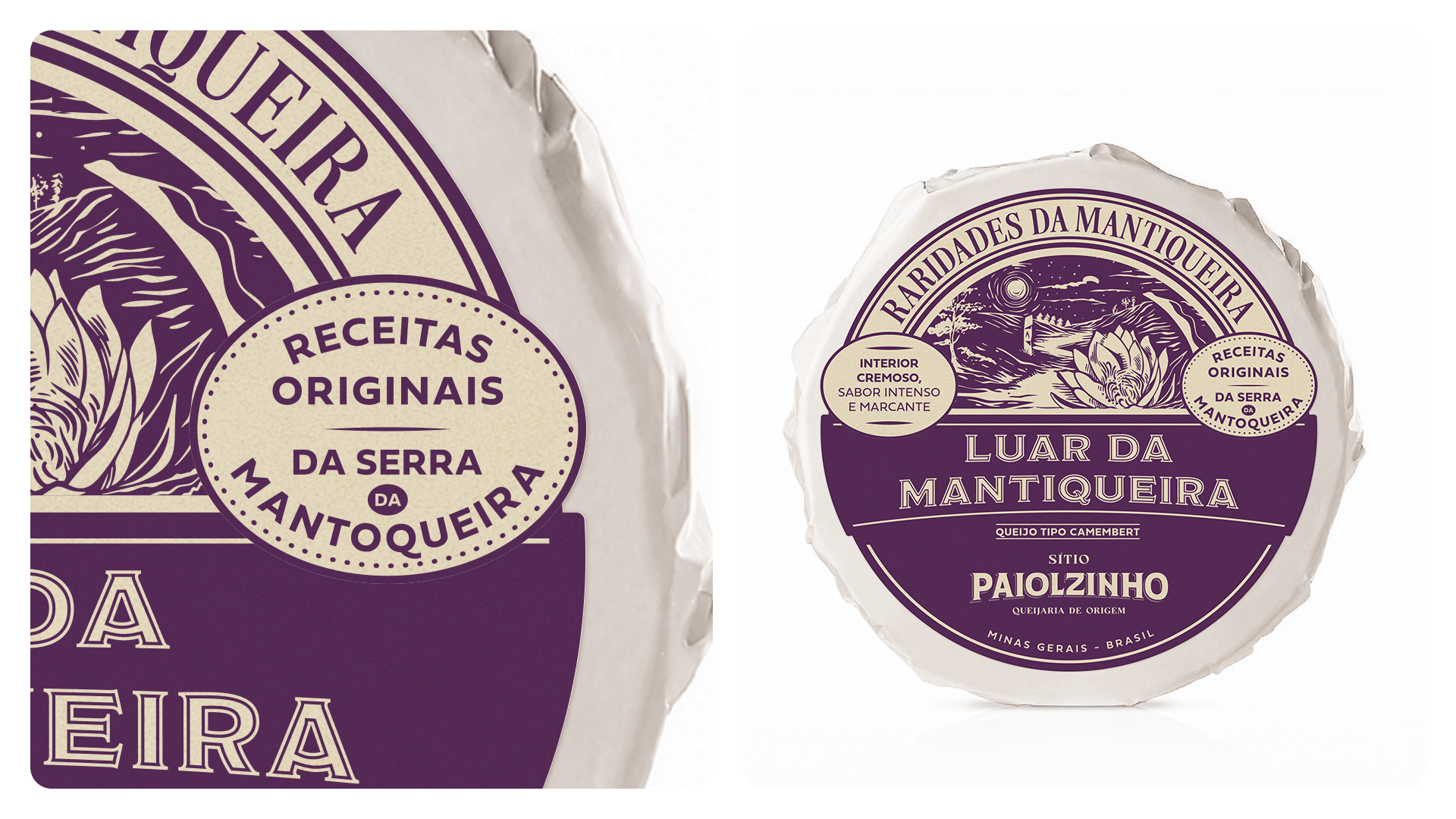
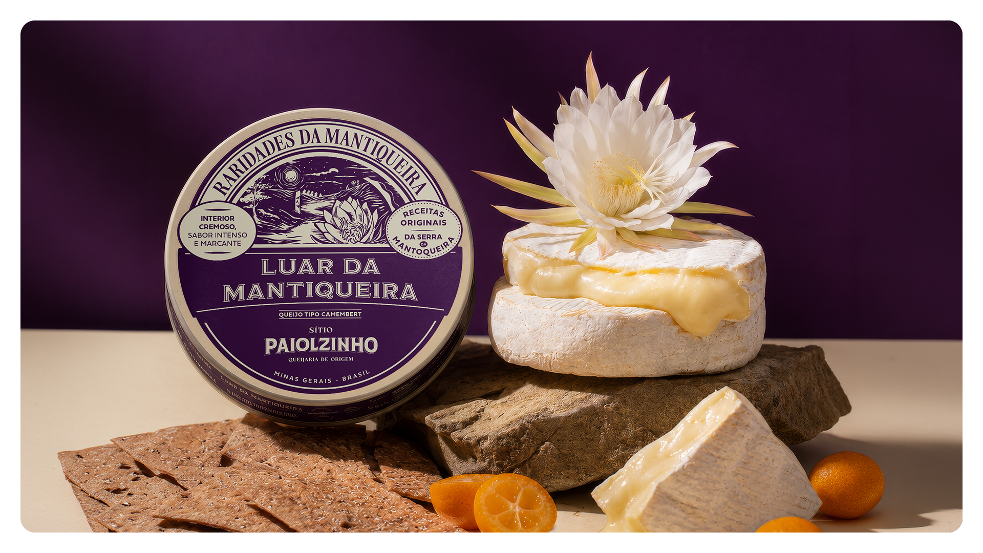
Luar da Mantiqueira é um projeto de embalagem criado para um queijo de mofo branco tipo Camembert, desenvolvido pelo Sítio Paiolzinho, em Minas Gerais. O produto faz parte da linha Raridades da Mantiqueira, uma seleção de queijos autorais inspirados no território, no clima, nas tradições e nas paisagens poéticas da Serra da Mantiqueira.
Luar da Mantiqueira é um projeto de embalagem criado para um queijo de mofo branco tipo Camembert, desenvolvido pelo Sítio Paiolzinho, em Minas Gerais. O produto faz parte da linha Raridades da Mantiqueira, uma seleção de queijos autorais inspirados no território, no clima, nas tradições e nas paisagens poéticas da Serra da Mantiqueira.
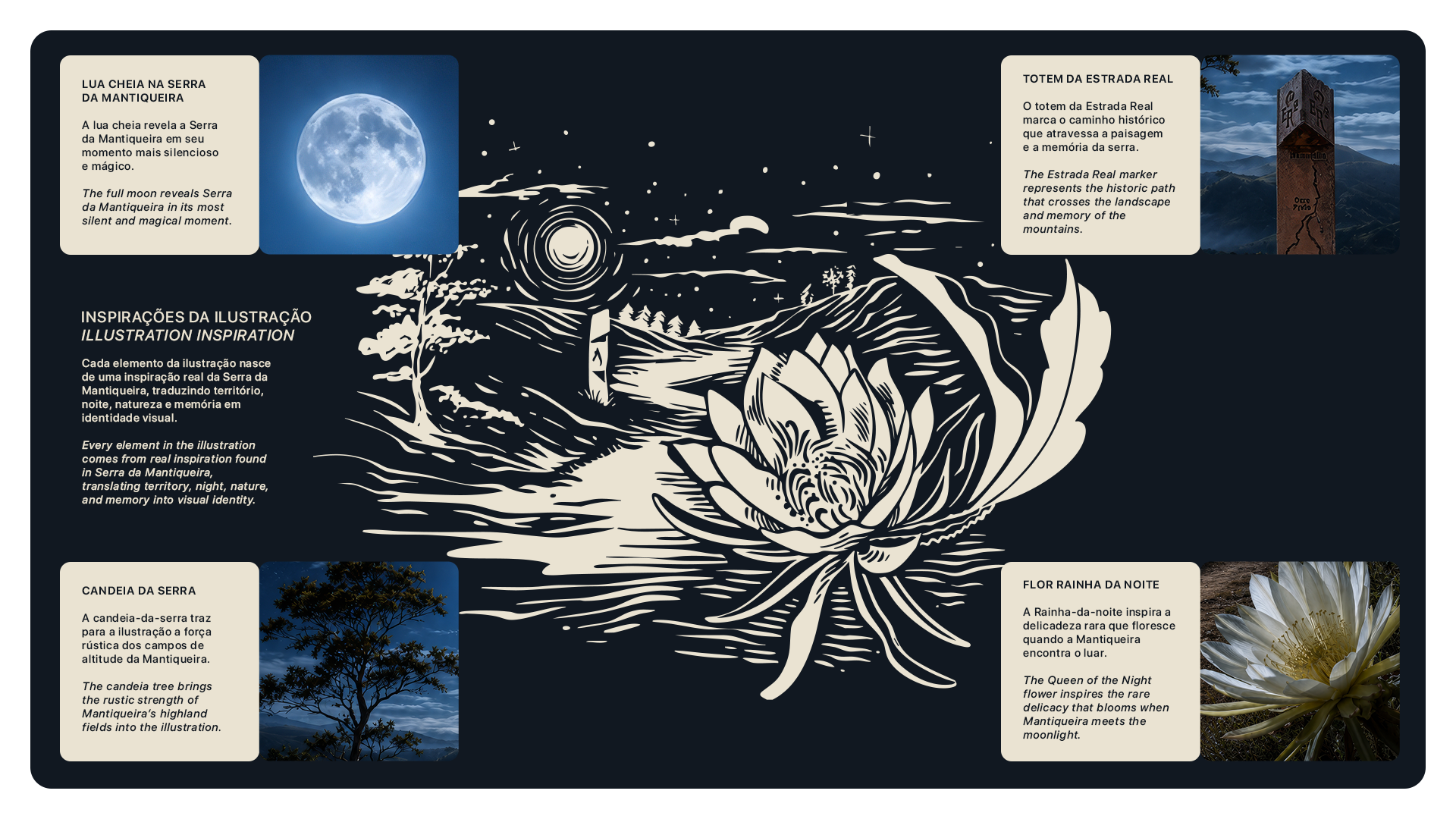
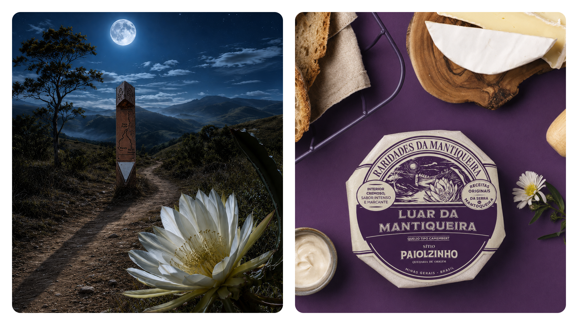
O conceito nasce de uma imagem simbólica: o momento em que o dia se despede ao longo da Estrada Real e a Mantiqueira se transforma em uma paisagem silenciosa sob a luz da lua cheia. Nesse cenário noturno, a Rainha-da-noite (Selenicereus grandiflorus) se torna o principal símbolo visual do projeto. Conhecida por florescer à noite, essa flor traduz a ideia de raridade, delicadeza e intensidade, características também presentes no queijo: interior cremoso, casca de mofo branco, 14 dias de maturação e sabor marcante.
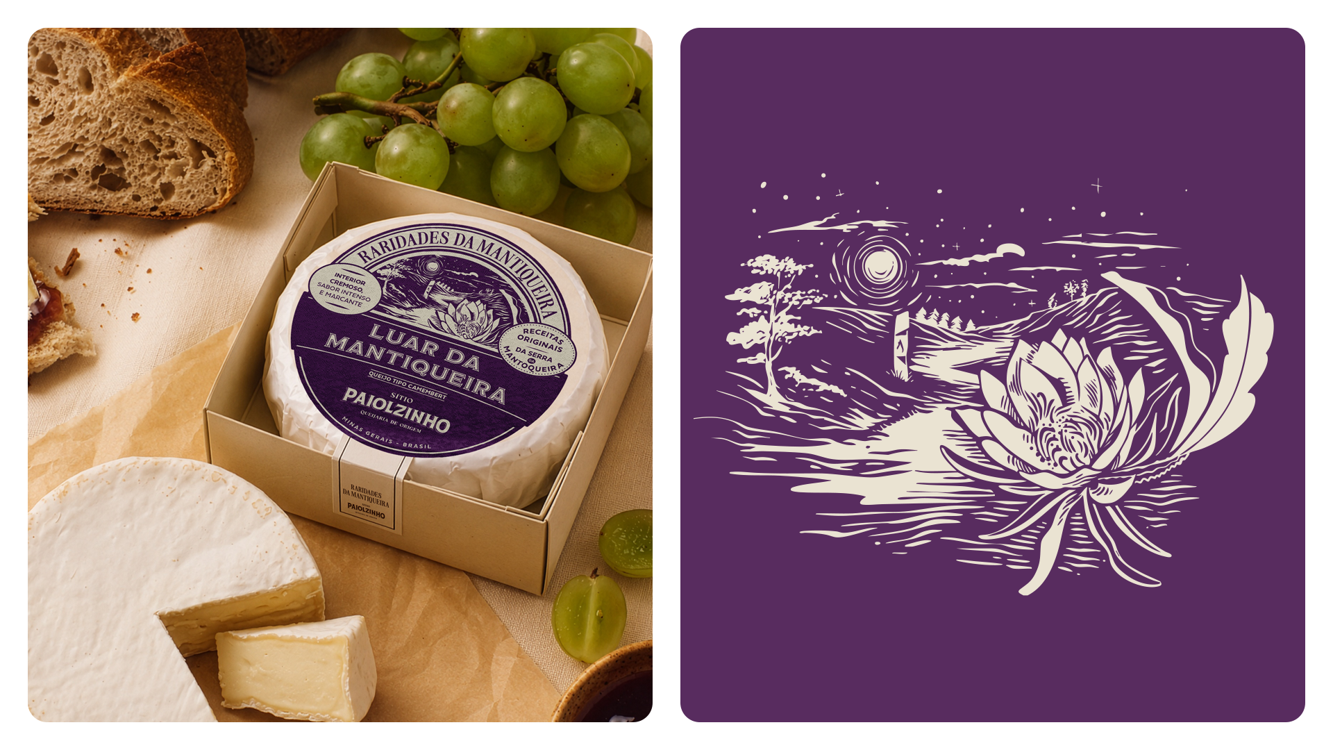
A ilustração da embalagem reúne elementos inspirados na região: a lua cheia sobre a Serra da Mantiqueira, o totem da Estrada Real, a vegetação de altitude e a flor Rainha-da-noite. Juntos, esses elementos constroem uma narrativa visual que conecta produto, origem e memória.
A paleta utiliza um roxo profundo para evocar noite, mistério e sofisticação, equilibrado por tons claros e naturais que preservam o caráter artesanal do queijo. O resultado é uma embalagem com presença, história e valor percebido, capaz de transformar um produto regional em uma experiência sensorial.
[ EN ]
Luar da Mantiqueira is a packaging project created for a white mold cheese, similar to Camembert, developed by Sítio Paiolzinho in Minas Gerais, Brazil.
The product is part of Raridades da Mantiqueira, a special line of signature cheeses inspired by the territory, climate, traditions, and poetic landscapes of Serra da Mantiqueira.
The concept was born from a symbolic image: the moment when the day fades along the Estrada Real and the Mantiqueira mountains become a silent landscape under the full moon. In this nocturnal atmosphere, the Queen of the Night flower (Selenicereus grandiflorus) becomes the main visual symbol of the project.
Known for blooming at night, this flower represents rarity, delicacy, and intensity, the same qualities found in the cheese: a creamy interior, white mold rind, 14 days of maturation, and a bold, memorable flavor.
The packaging illustration brings together elements inspired by the region: the full moon over Serra da Mantiqueira, the Estrada Real landmark, the highland vegetation, and the Queen of the Night flower. Together, these elements create a visual narrative that connects product, origin, and memory.
The color palette uses a deep purple tone to evoke night, mystery, and sophistication, balanced with light and natural tones that preserve the artisanal character of the cheese. The result is a packaging system with presence, storytelling, and perceived value, transforming a regional product into a sensory experience.
Chaminé Team
Market Research & Brand Strategy: Pablo Eduardo Frandoloso
Naming & Verbal Identity: Pablo Eduardo Frandoloso
Packaging Designer: Matheus Corseuil
Packaging Designer: Matheus Corseuil
Creative Director: Daniel Zonta
Illustrations: Fabrício Rangel
Client
Sítio Paiolzinho | 2026
Sítio Paiolzinho | 2026
Project
pesquisa de mercado I estratégia de marca | naming I identidade visual e verbal | embalagem
market research I brand strategy | criação de nome I visual and verbal identity I packaging
pesquisa de mercado I estratégia de marca | naming I identidade visual e verbal | embalagem
market research I brand strategy | criação de nome I visual and verbal identity I packaging
