
[ PT-BR ]
Depois do reposicionamento da marca, o próximo passo de nosso trabalho com a SCOZ foi fazer a embalagem sustentar essa transformação.
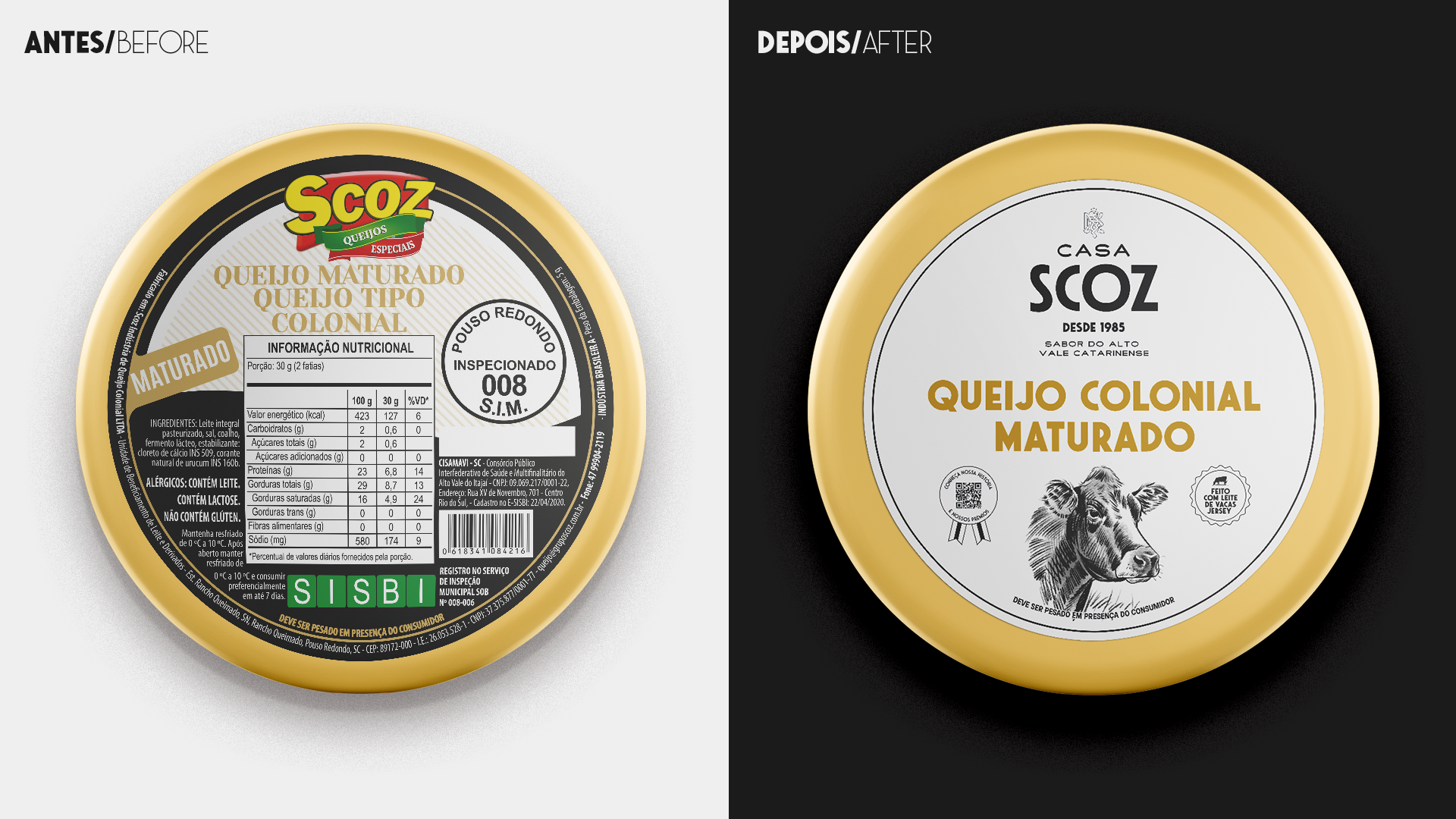
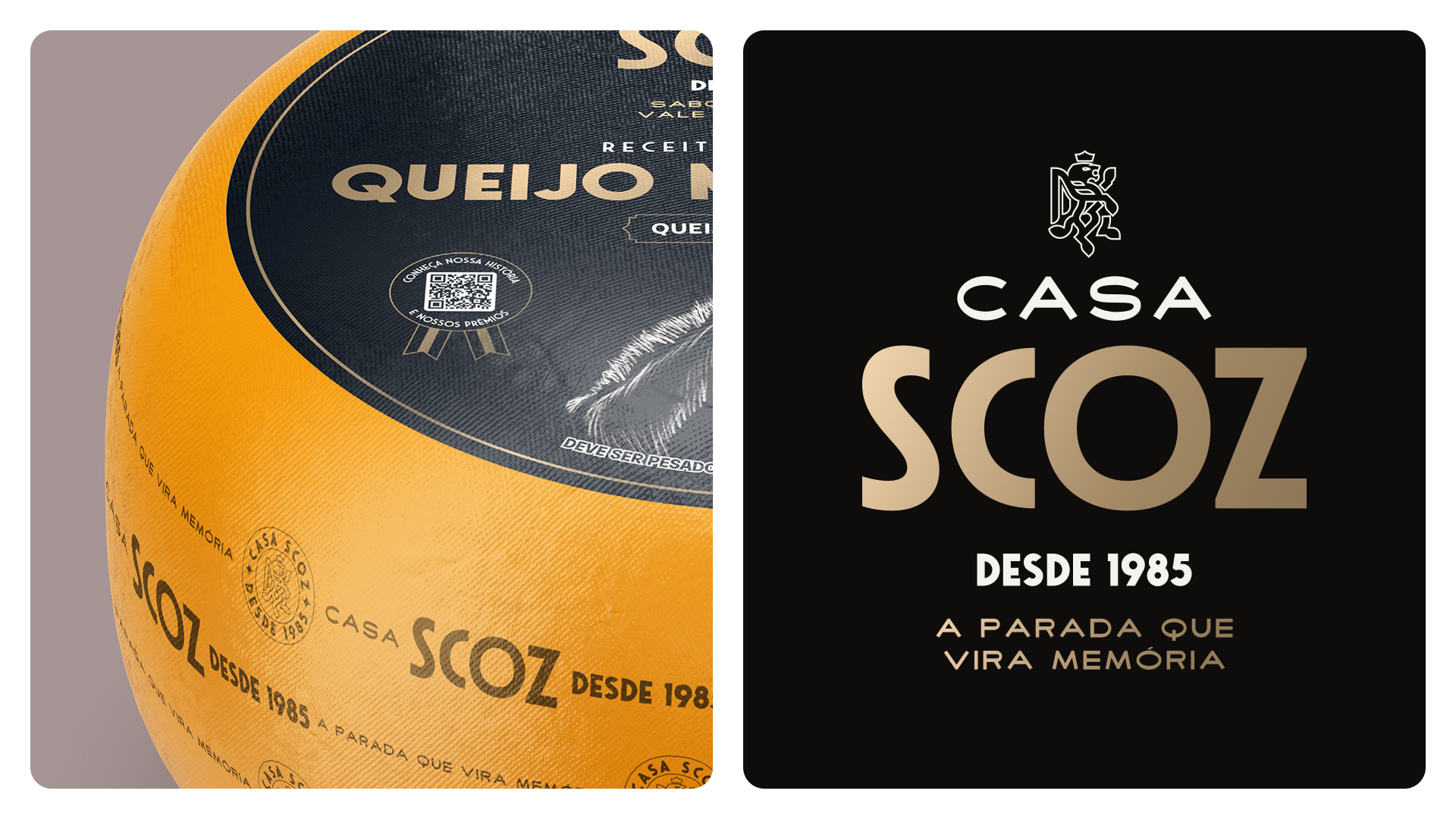
As antigas embalagens já não traduziam a qualidade dos produtos nem a nova percepção que a marca precisava construir. Havia excesso de informação, pouca hierarquia visual e uma apresentação que limitava a leitura do portfólio e o valor percebido no ponto de venda. Redesenhamos o sistema de embalagens para transformar a forma como os queijos chegam ao consumidor.
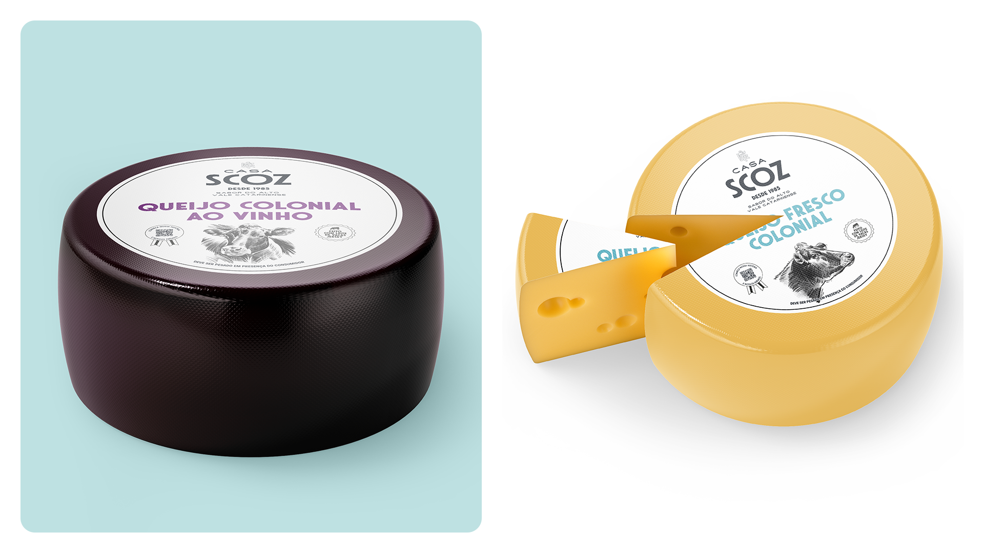
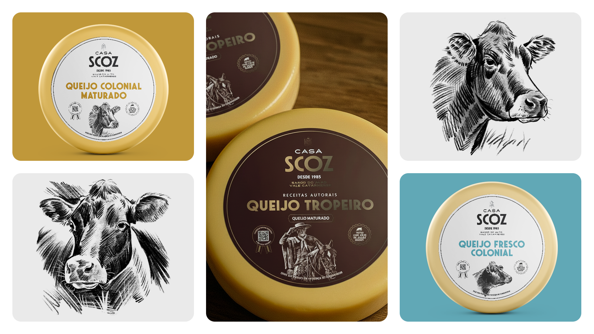
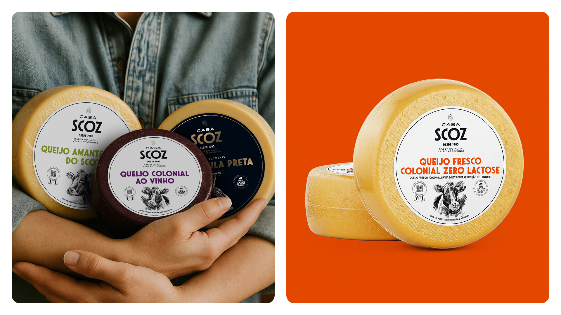
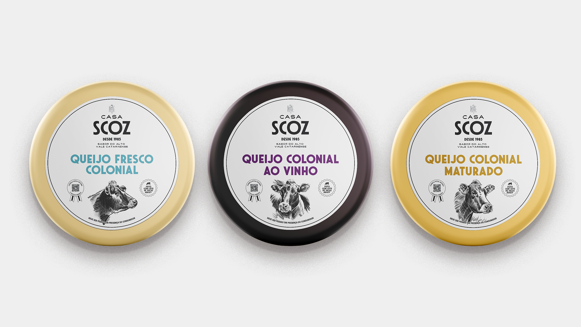
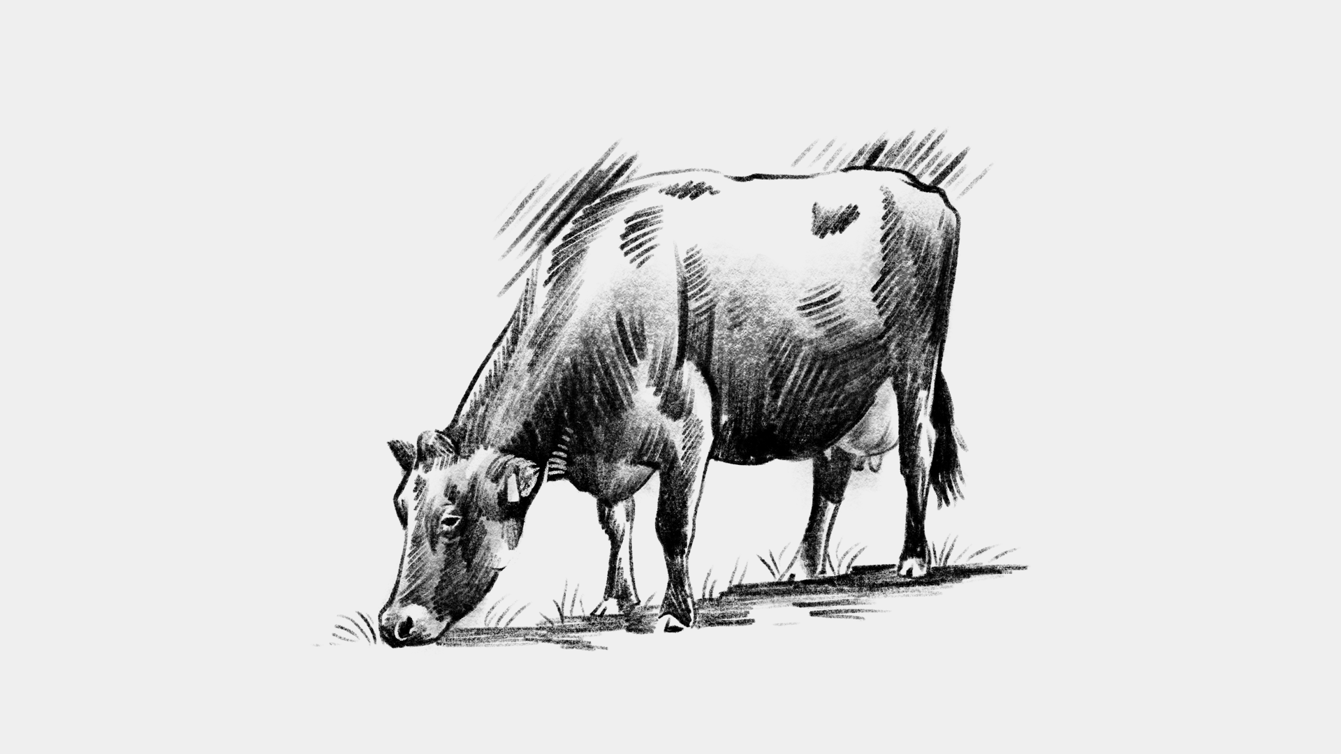
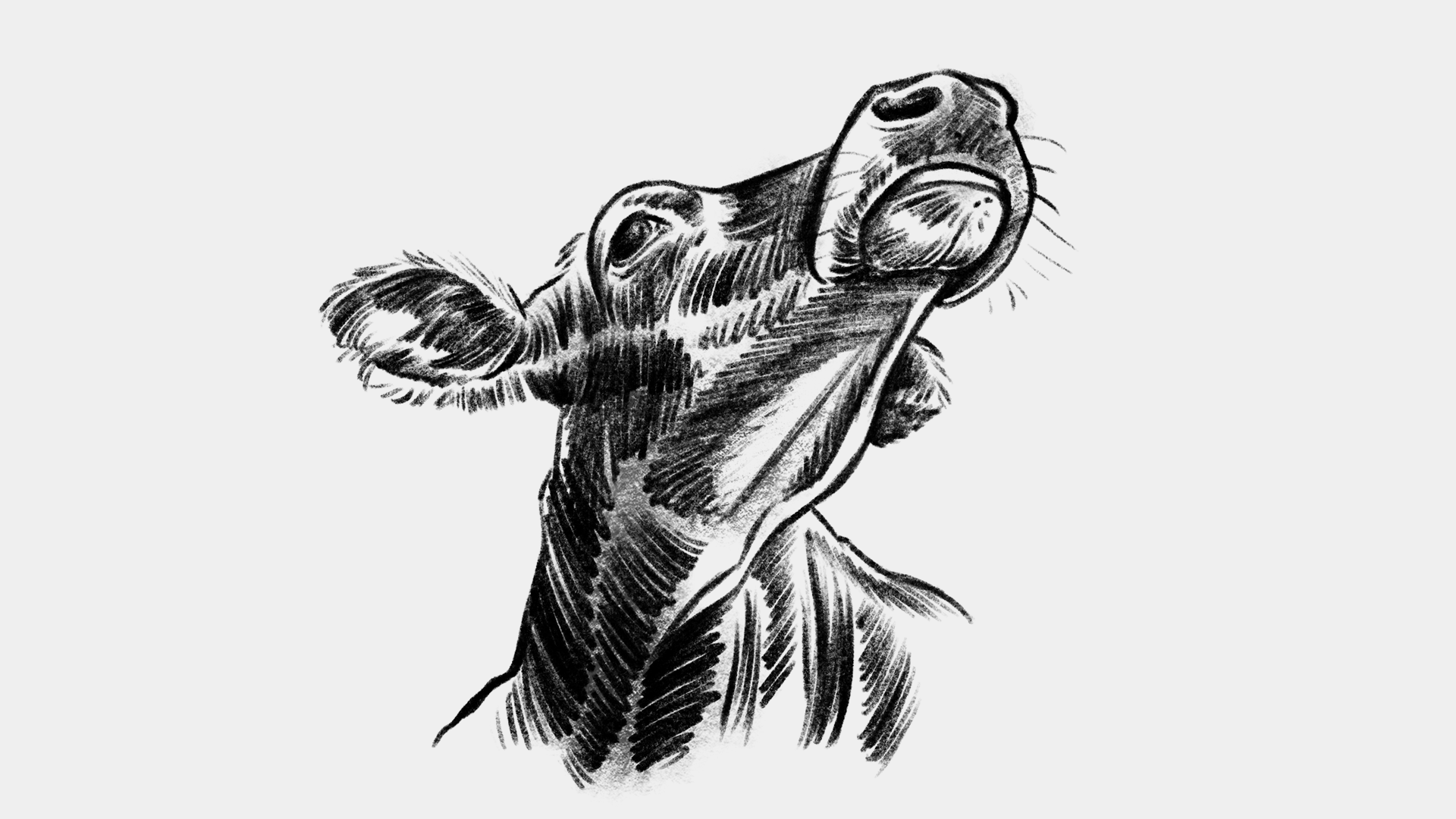
Para isso, demos protagonismo à assinatura Casa Scoz, reforçamos a leitura do nome de cada produto, reorganizamos as informações obrigatórias e construímos uma composição visual mais limpa e marcante. As ilustrações destacaram o principal atributo da marca: o leite de Vacas Jersey. Esses elementos passaram a cumprir um papel importante na narrativa, ajudando a valorizar a origem, a matéria-prima e o caráter artesanal da produção.
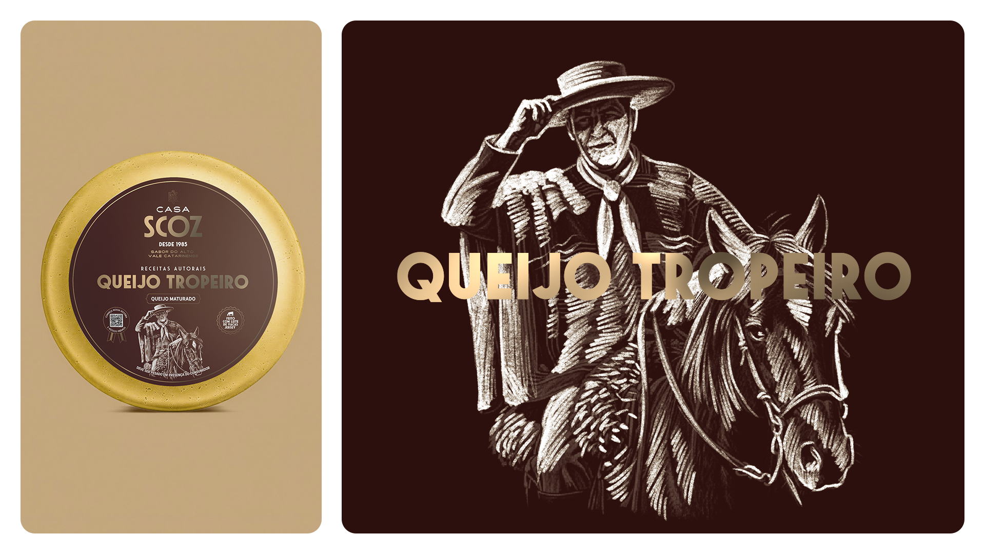
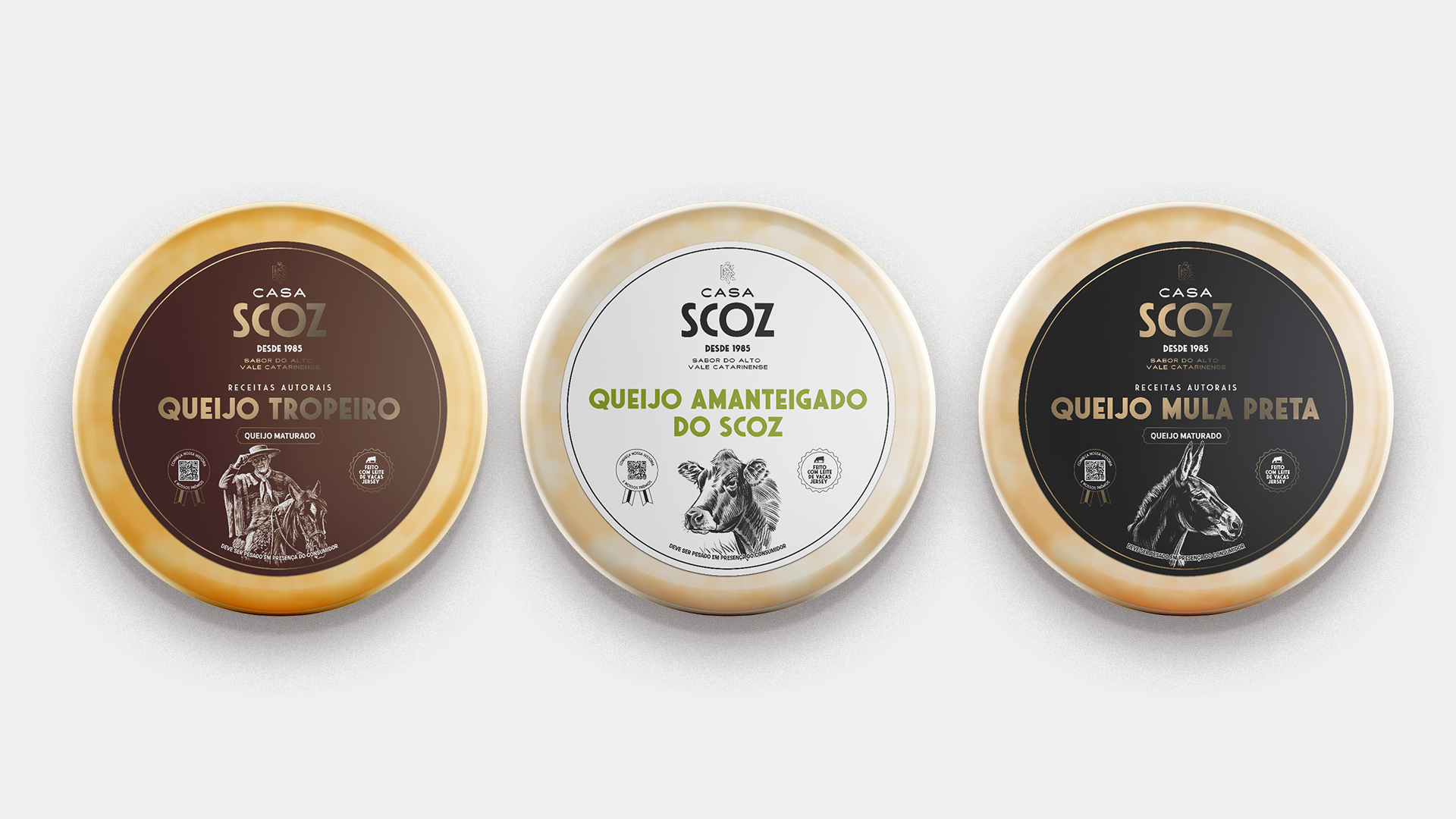
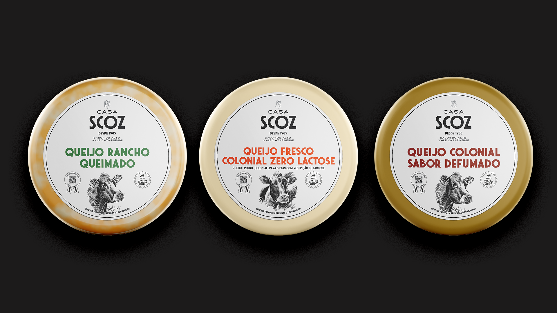
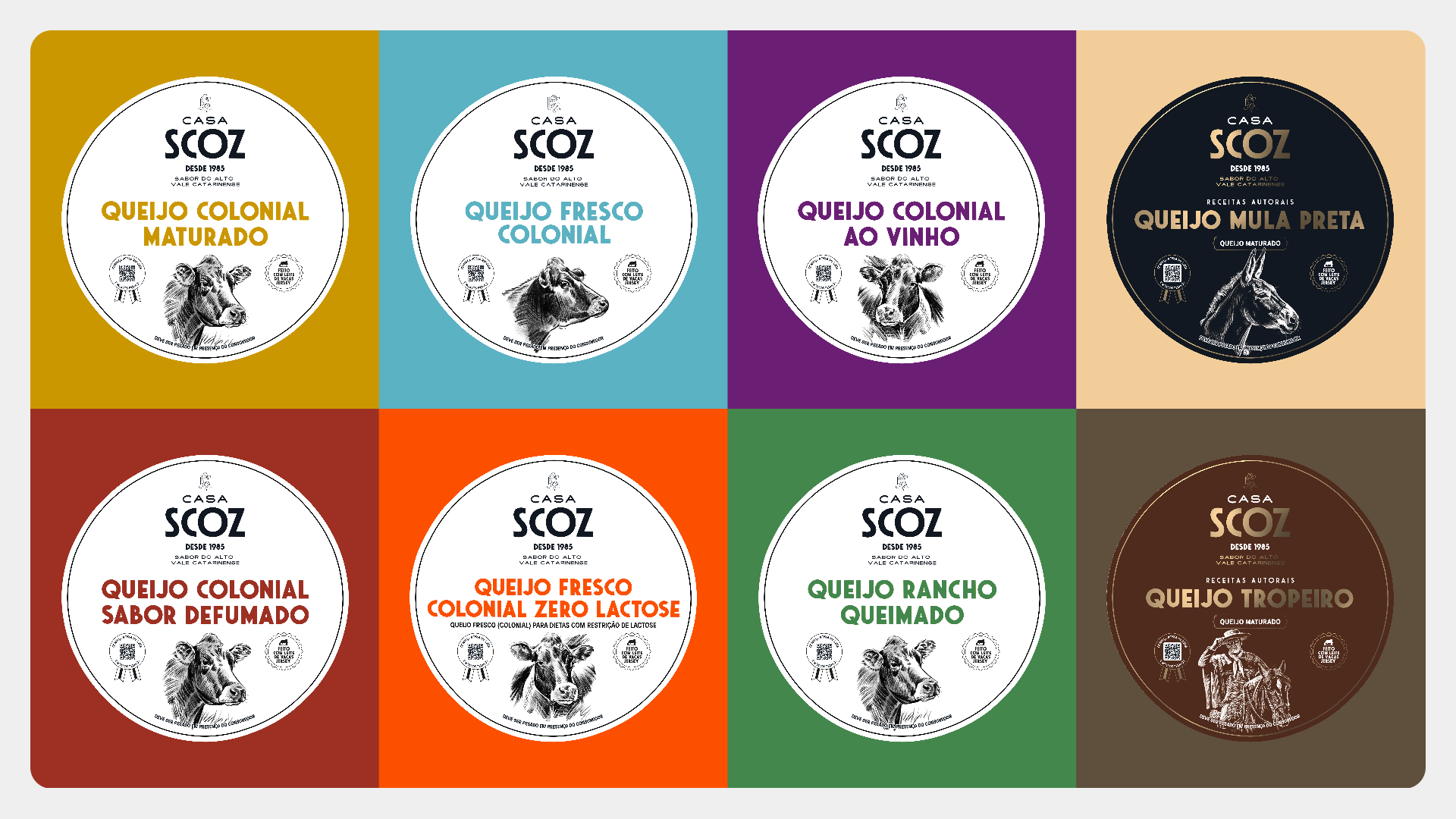
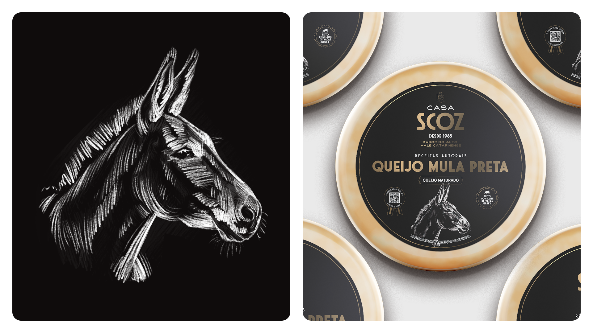
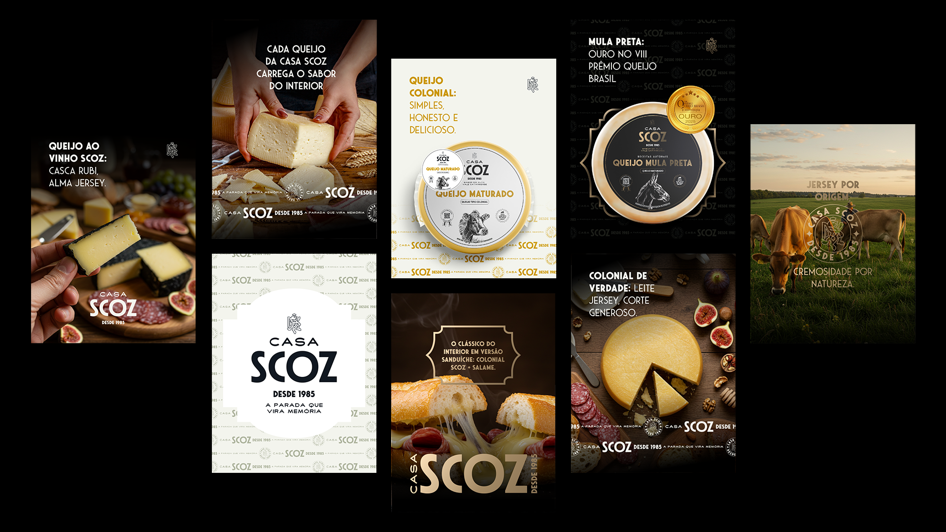
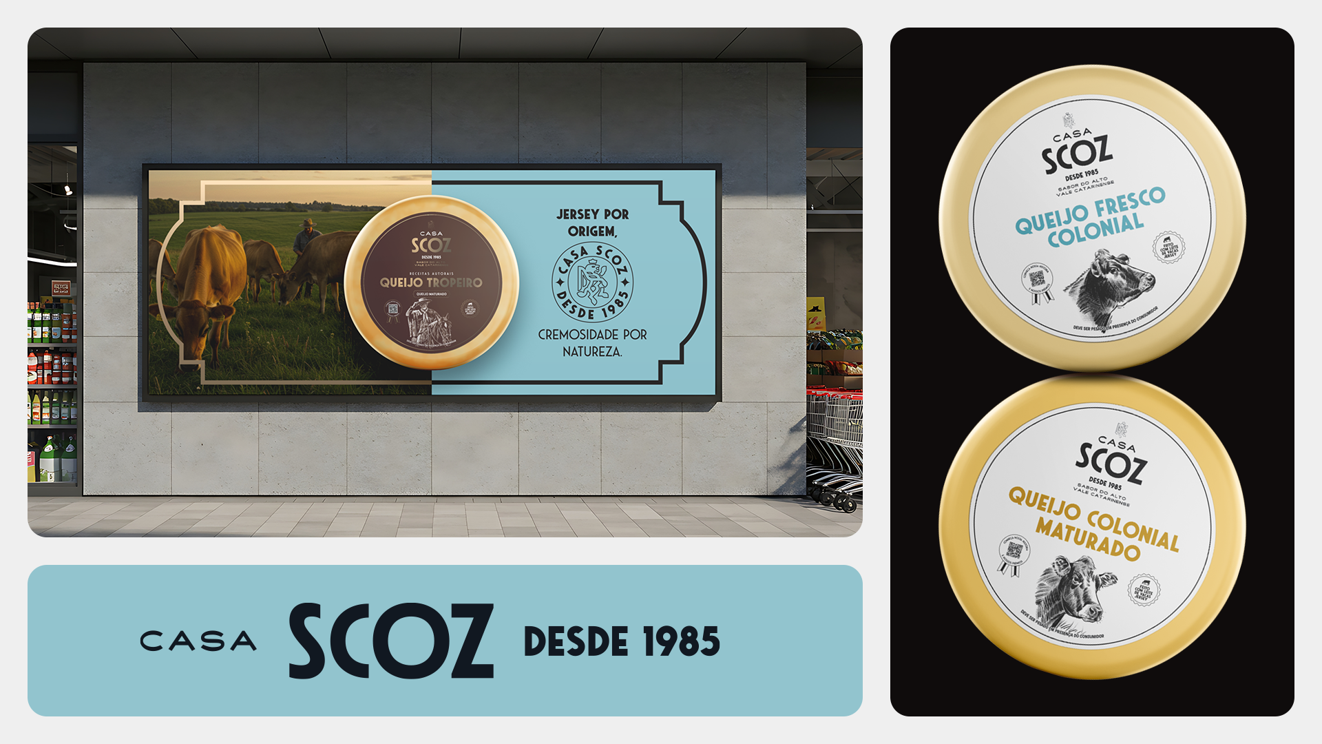
Também desenvolvemos um sistema de diferenciação para o portfólio. Na linha regular, criamos uma base visual unificada, com melhor padronização entre os SKUs e códigos cromáticos que ajudam a distinguir cada variedade. Já para os queijos autorais, propusemos um tratamento próprio: embalagens mais sóbrias, densas e sofisticadas, que destacam essas receitas como uma camada especial da marca.
O antes e depois evidencia como decisões de design podem elevar percepção de valor, fortalecer a identidade da marca e transformar a experiência de quem vê, escolhe e consome.
[ EN ]
After the brand repositioning, the next step in our work with SCOZ was to ensure the packaging could fully support that transformation.
[ EN ]
After the brand repositioning, the next step in our work with SCOZ was to ensure the packaging could fully support that transformation.
The previous packaging no longer reflected the quality of the products or the new brand perception SCOZ needed to build. There was an excess of information, limited visual hierarchy, and a presentation that weakened both portfolio clarity and perceived value at the point of sale. We redesigned the packaging system to transform the way these cheeses meet the consumer.
To achieve this, we gave greater prominence to the Casa Scoz signature, strengthened the visibility of each product name, reorganized the mandatory information, and created a cleaner, more distinctive visual composition. The illustrations were designed to highlight the brand’s key attribute: Jersey cow milk. Together, these elements became an important part of the narrative, helping communicate origin, raw material quality, and the artisanal nature of the production.
We also developed a differentiation system for the portfolio. For the core line, we created a unified visual foundation, with stronger consistency across SKUs and color coding that helps distinguish each variety. For the signature cheeses, we proposed a distinct treatment: more understated, dense, and sophisticated packaging that positions these recipes as a special layer within the brand.
The before-and-after clearly shows how design decisions can elevate perceived value, strengthen brand identity, and transform the experience of those who see, choose, and consume the product.
Chaminé Team
Strategy: Pablo Eduardo Frandoloso
Graphic Designer: Matheus Corseuil
Illustration: Fabrício Rangel
Creative Director Daniel Zonta
Project Manager: Lamaisson Marques
Strategy: Pablo Eduardo Frandoloso
Graphic Designer: Matheus Corseuil
Illustration: Fabrício Rangel
Creative Director Daniel Zonta
Project Manager: Lamaisson Marques
Client
Casa Scoz | 2026
Project
identidade visuall | embalagem
visual identity | visual and verbal identity
identidade visuall | embalagem
visual identity | visual and verbal identity
