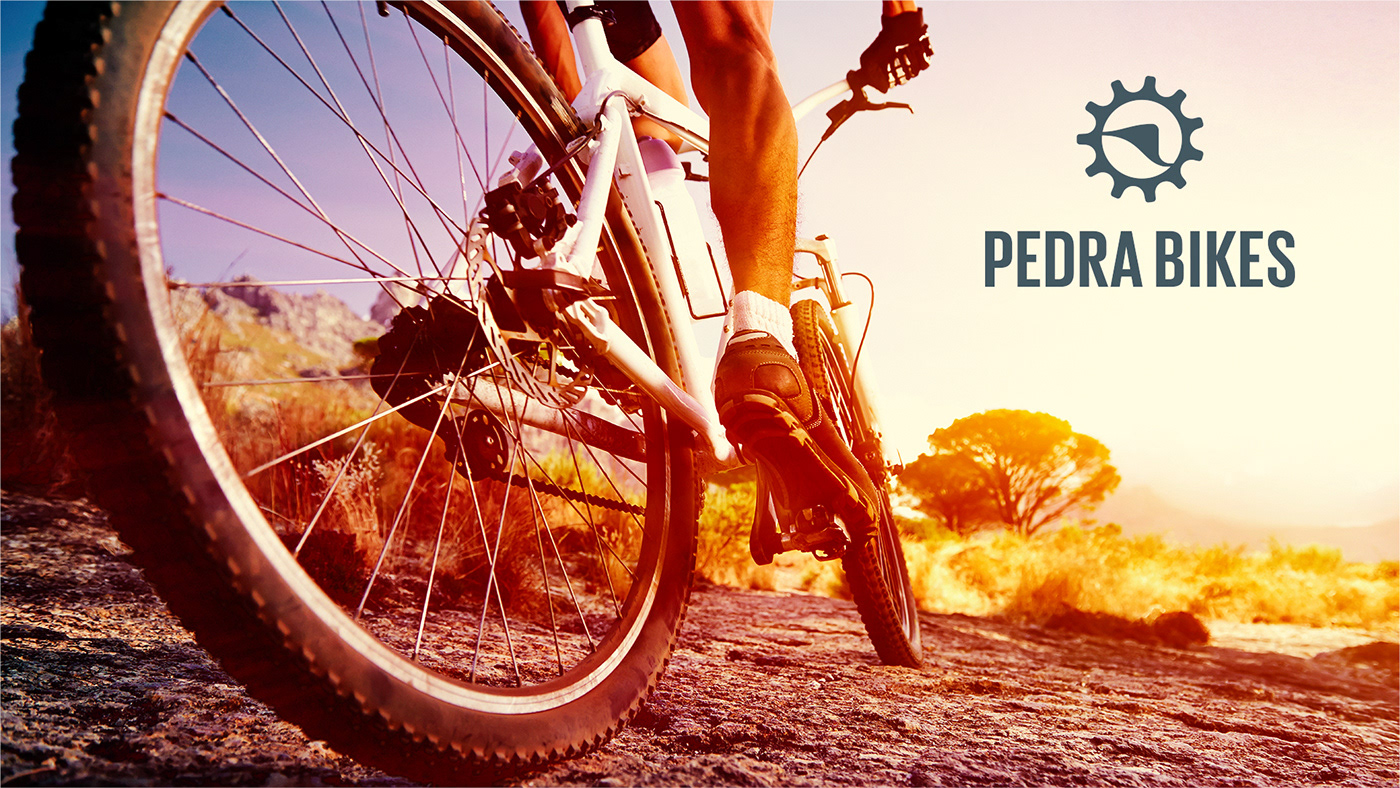
Pedra Bikes
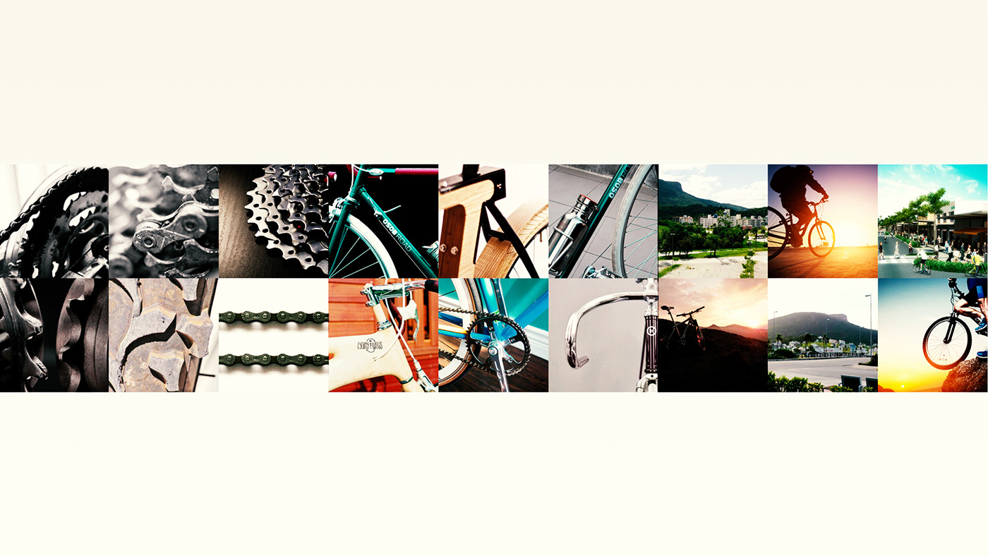
The bike shop Stone Bikes is located at the Pedra Branca Project, based in Palhoça, Santa Catarina - Brasil. Which is a project that has a differential that can change the lives of people who live there in different ways. After all, when one lives in a sustainable universe, the vision for the world and references change completely. Mountain Bike is a sport that involves strength, dexterity and self-sufficiency.
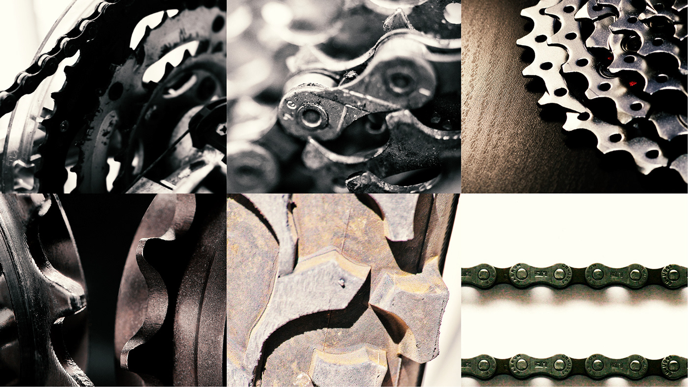
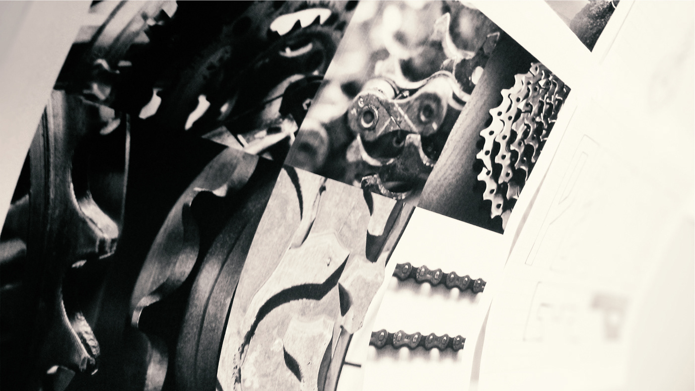
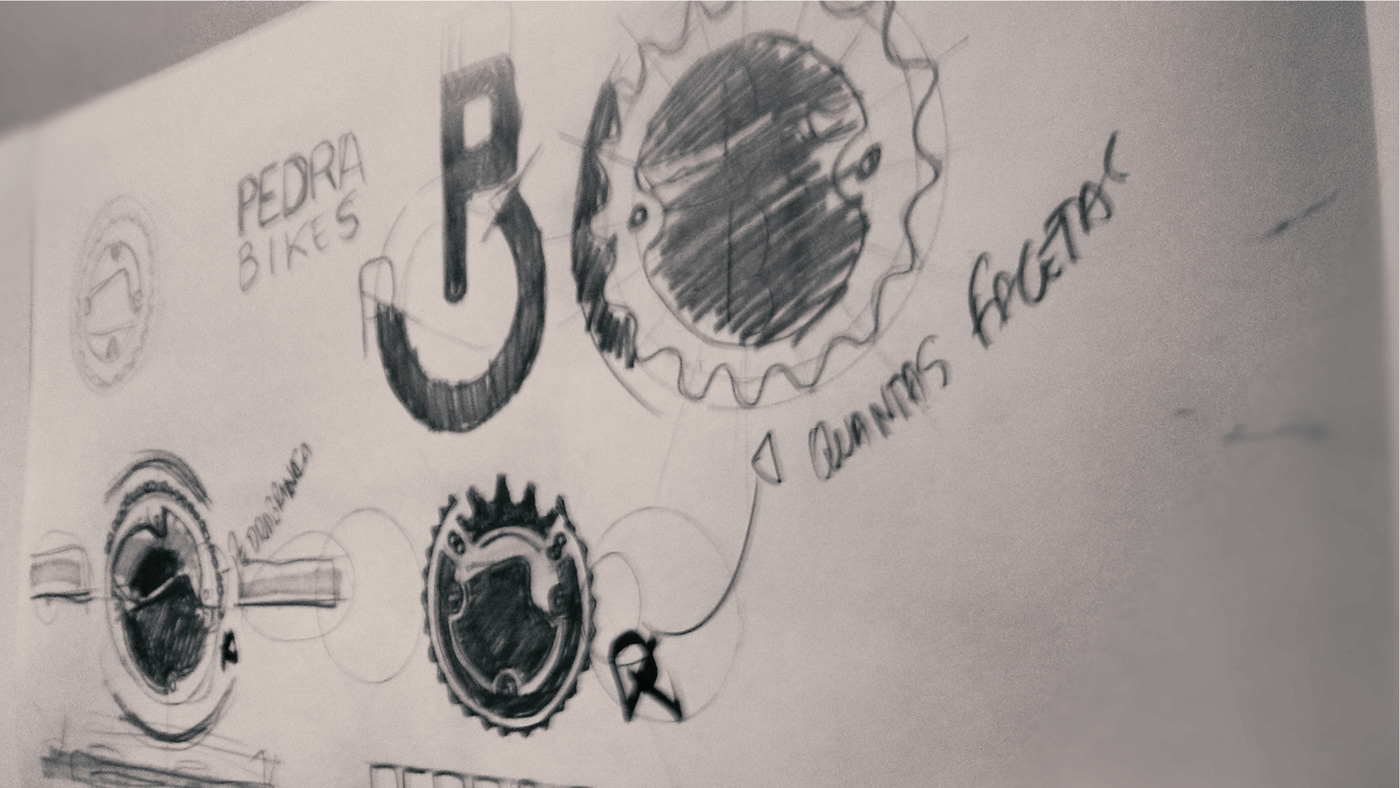
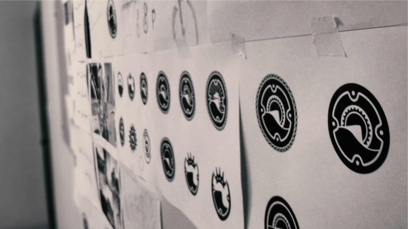
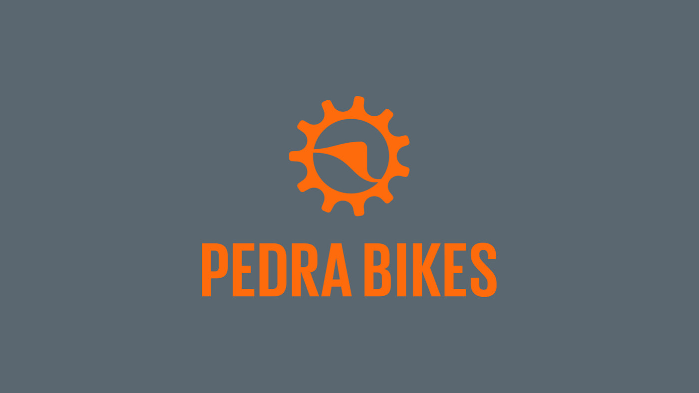
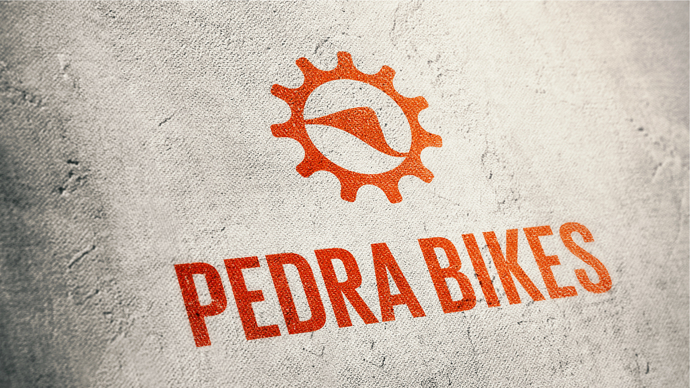
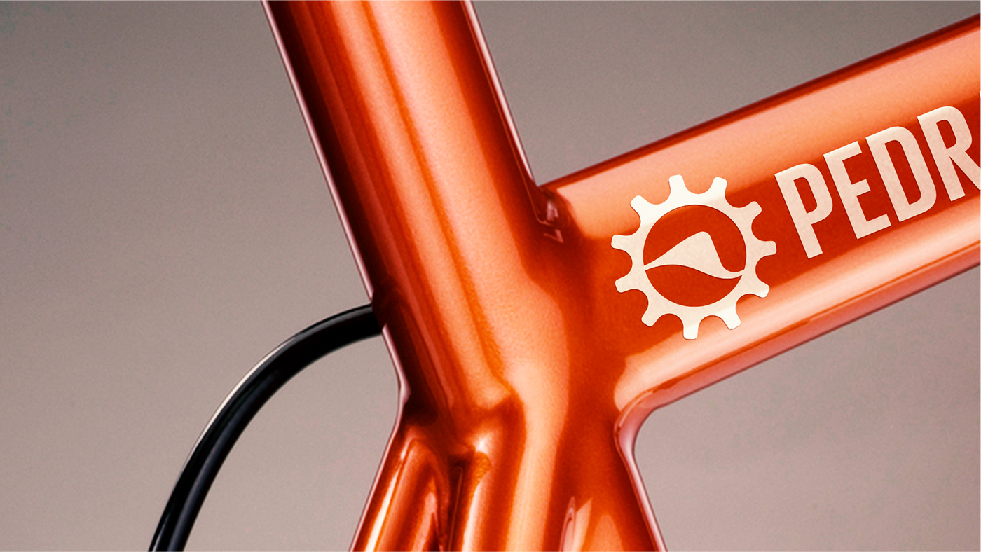
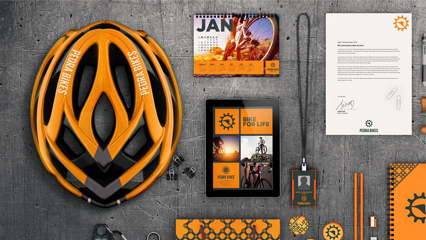
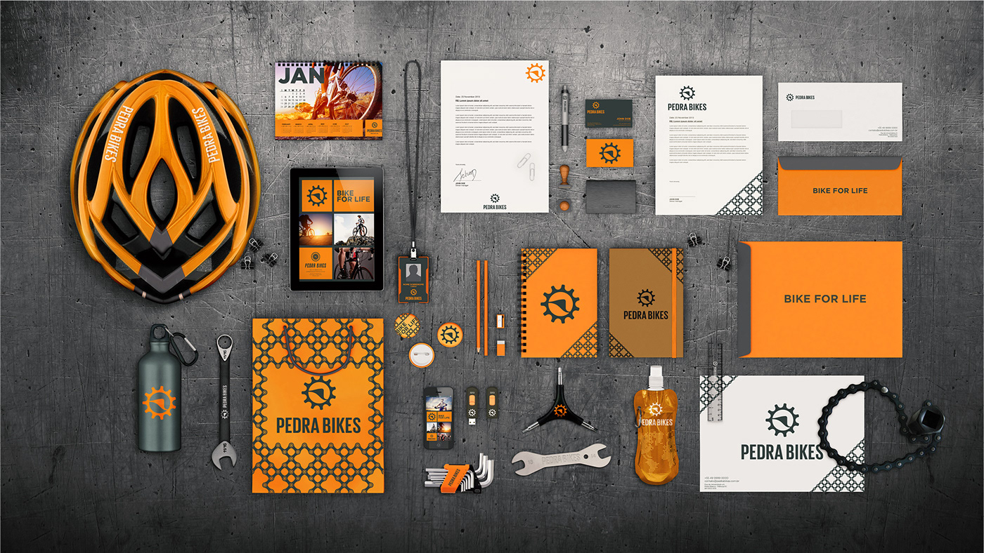
As is common practice the sport in isolated locations, the aspect of self-sufficiency is important so that the rider can perform minor repairs on your bike. Pedra Bikes will have consumers who live in the Pedra Branca Project and can expand to visitors and future online buyers seeking quality service and live the concept bike at different times of your routine. For the development of symbol, we use two ideas that were in the briefing and could not miss: A bicycle element and an element of Pedra Branca. For bicycle use the ratchet teeth 11, symbolizing the march is more of a bicycle, and the White Stone, symbolized with the hill that is a landmark of reference. Together the two symbols form a rising sun, referring the idea of a new and sustainable world.
A loja de bicicletas Pedra Bikes se encontra no Projeto Pedra Branca, que é um projeto que conta com um diferencial que pode mudar a vida das pessoas que lá moram de diferentes formas. Afinal, quando se convive em um universo sustentável, a visão quanto ao mundo e suas referências mudam completamente. Mountain Bike é um esporte que envolve resistência, destreza e auto-suficiência. Como é comum a prática do esporte em locais isolados, o aspecto de auto-suficiência é importante para que o ciclista consiga realizar pequenos reparos em sua bicicleta.
A Pedra Bikes vai ter consumidores que moram no Projeto Pedra Branca, podendo expandir para visitantes e futuramente compradores online que buscam qualidade no serviço e vivem o conceito de bicicletas nos diferentes momentos da sua rotina. Para o desenvolvimento do símbolo, usamos duas ideias que estavam no briefing e não podiam faltar: Um elemento da bicicleta e um elemento da Pedra Branca. Para a bicicleta utilizamos a catraca de 11 dentes, que simboliza a marcha mais for de uma bicicleta, e para a Pedra Branca, simbolizamos com o morro que é um marco de refência. Juntos os dois símbolos formam um sol nascente, remetendo a ideia de um mundo novo e sustentável.
Agency: triocom.com.br
Creative Director: Matheus Corseuil
Art Director: Lucas Matheus
Planning: Estevan Baldissera
Year: 2015
Follow me!
Designed in Brasil by matheuscorseuil®.
© All rights reserved.